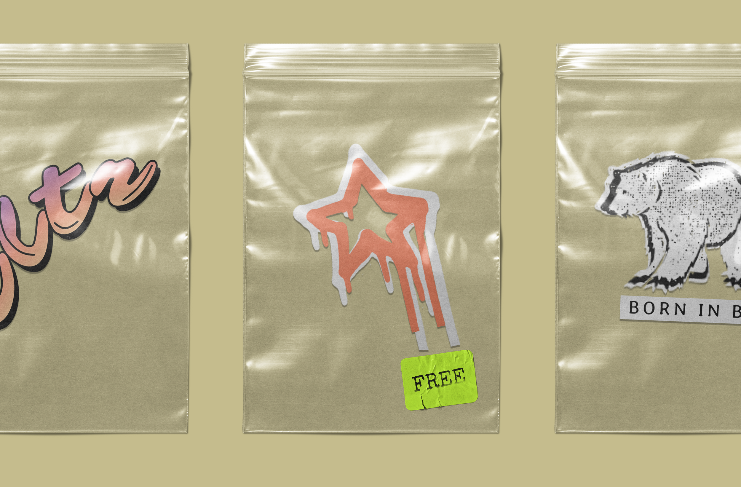
Art direction and design for a kombucha company.
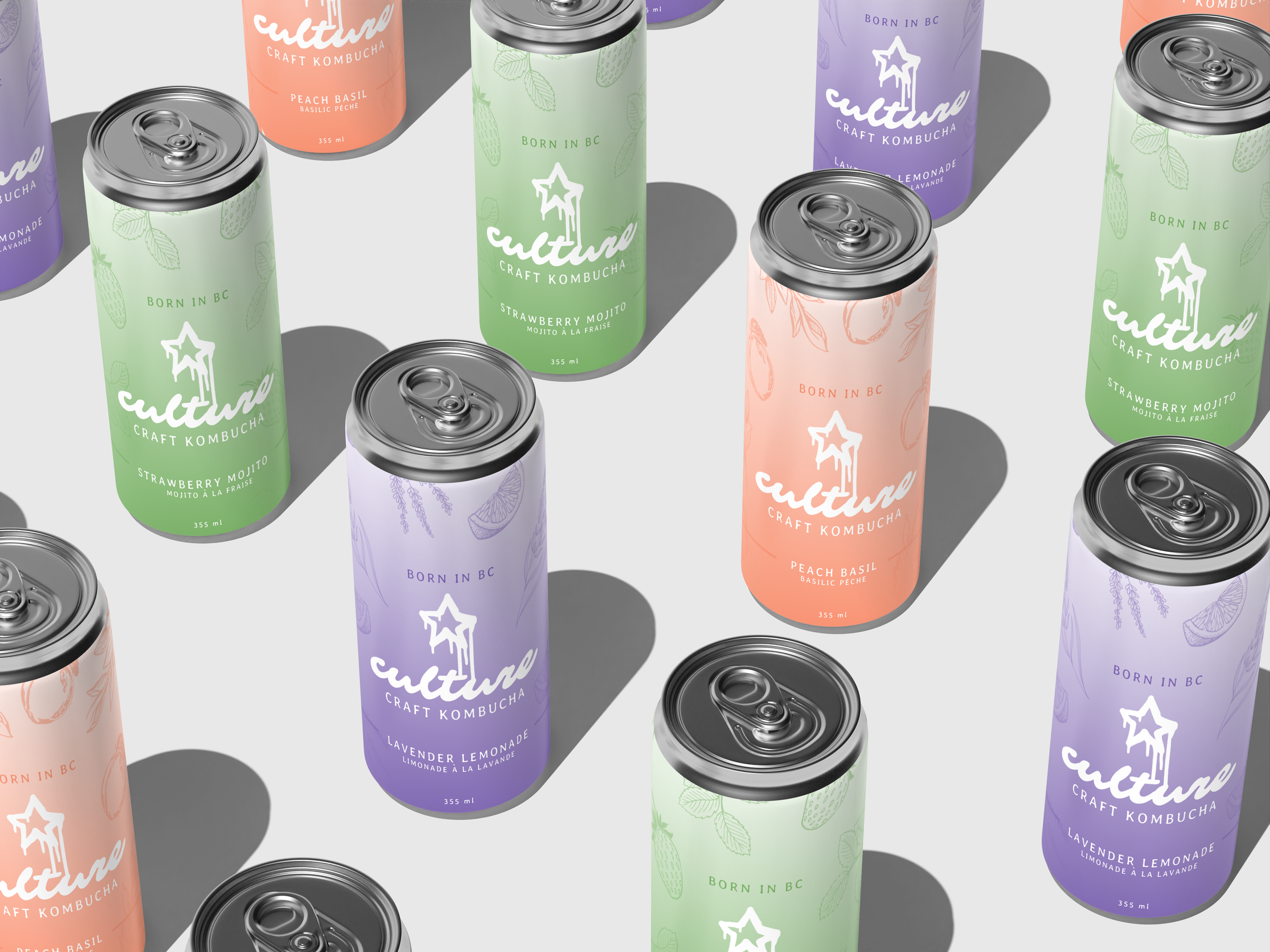
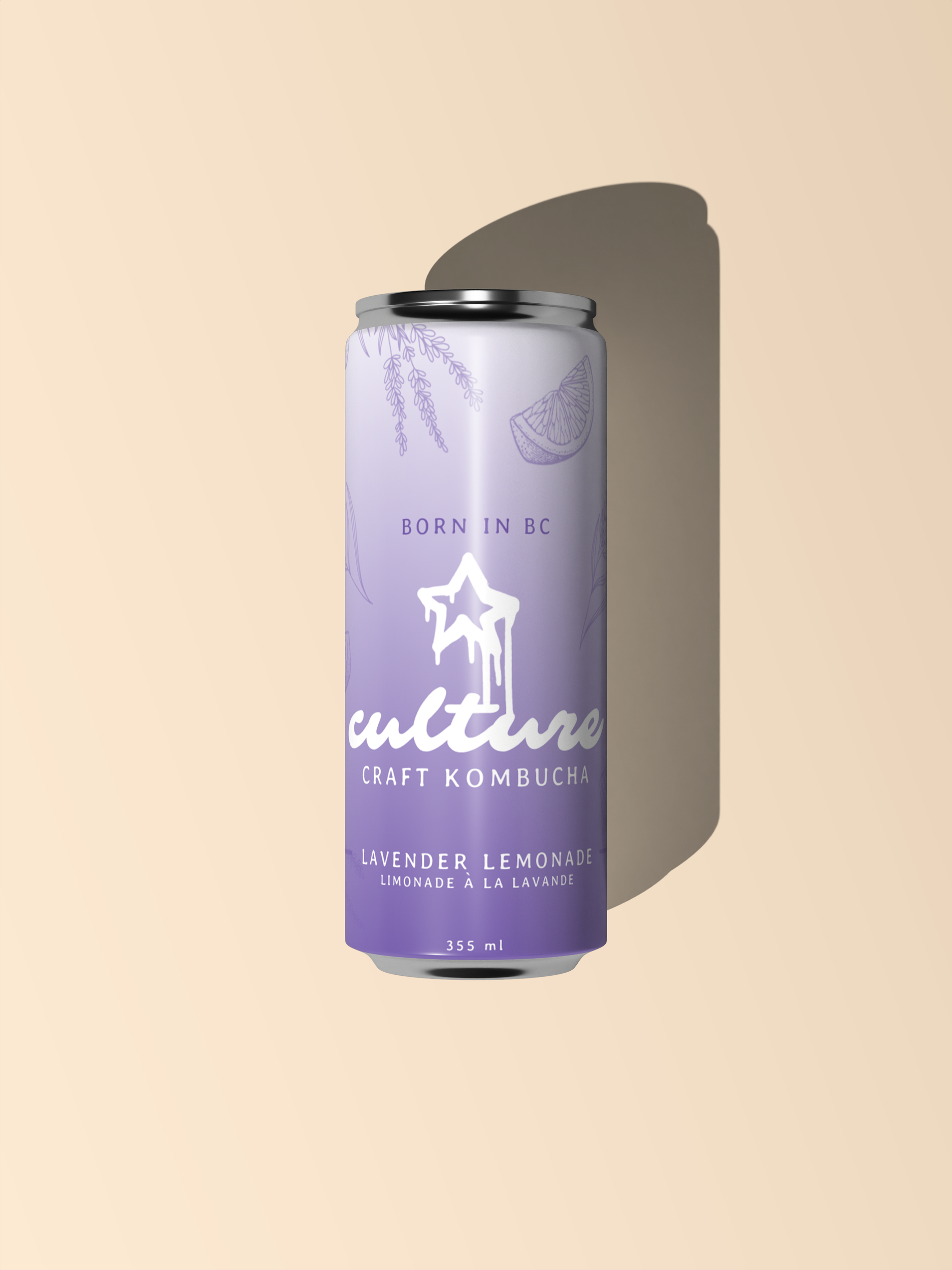
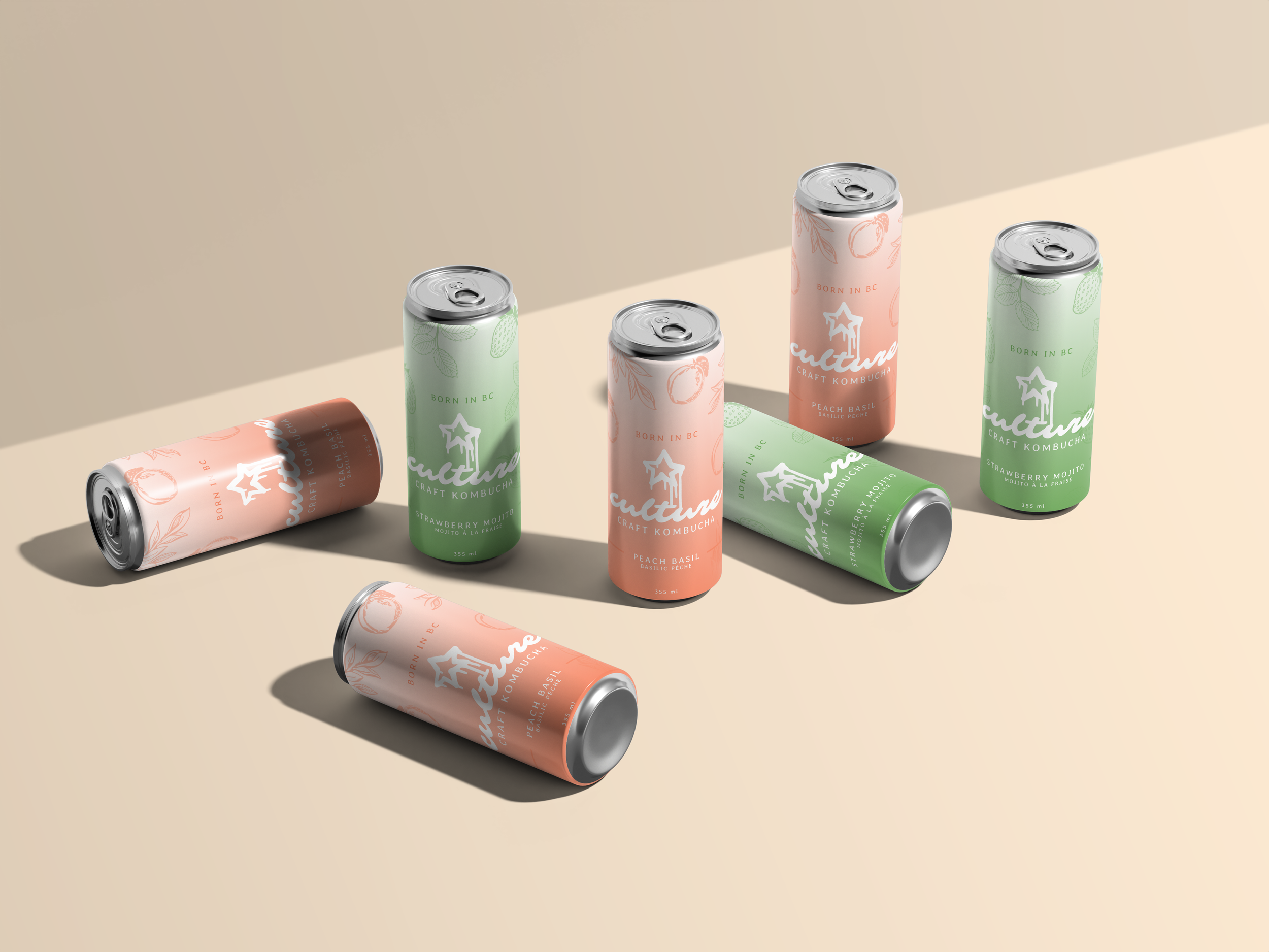
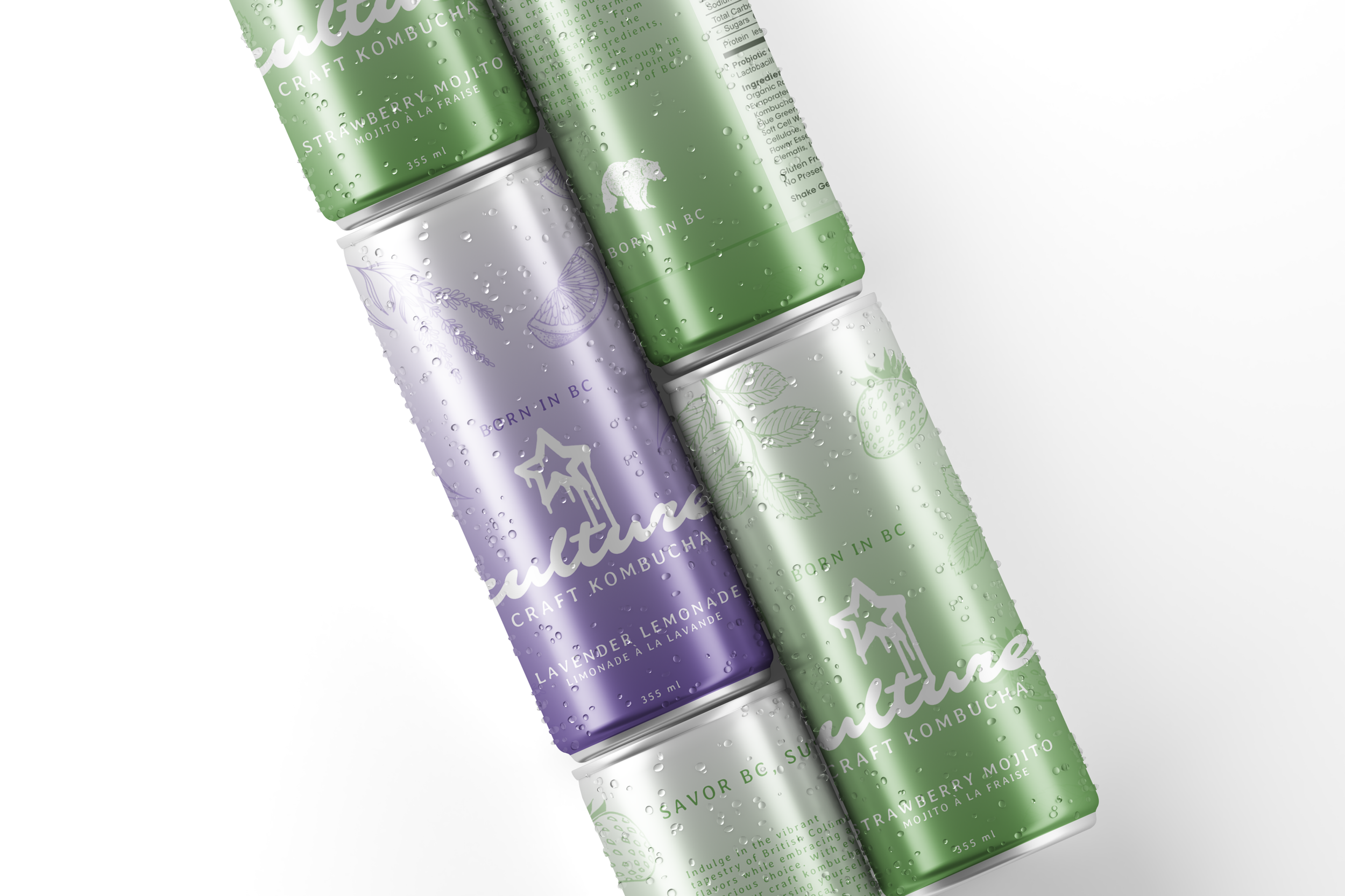
The brand identity for Culture Craft Kombucha uses a pastel color system to differentiate flavours, paired with hand drawn line illustrations of fruits and herbs to signal ingredients. A bold handwritten-style logotype anchors the design, while clean layouts keep the cans modern and easy to read. The art direction emphasizes clarity, consistency, and shelf impact.

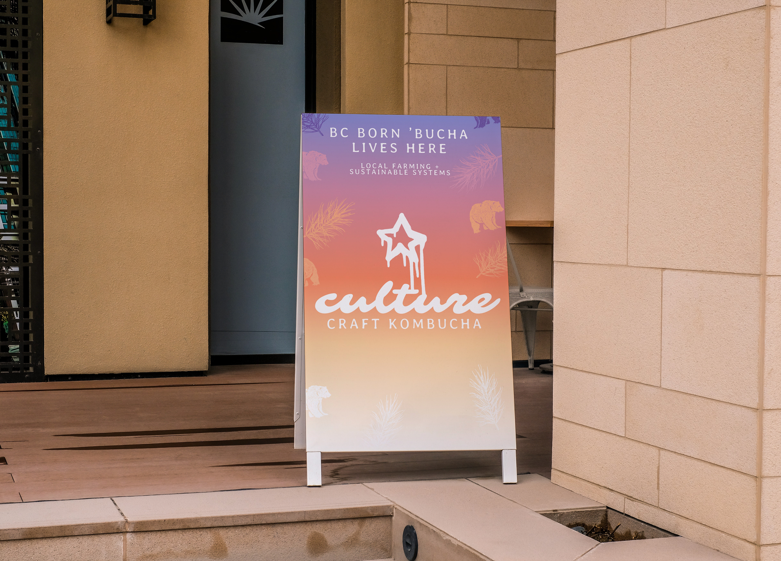
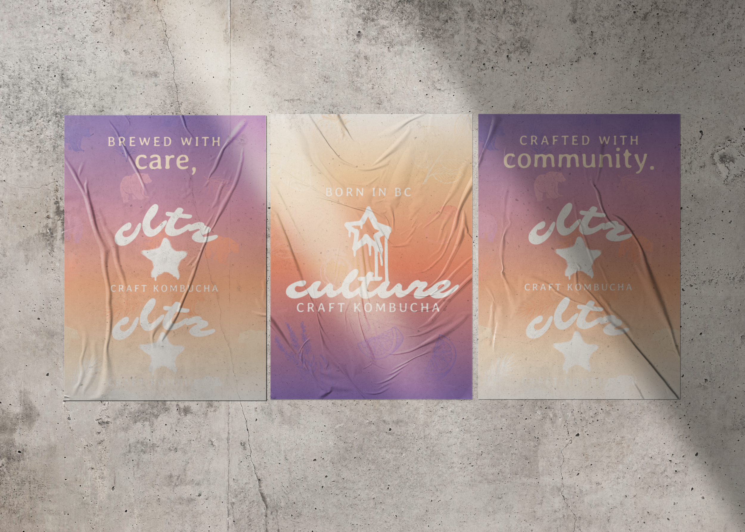
Our cultures star-spangled banner.
The flag and posters turn the brand into a movement. The star icon and bold logotype are paired with phrases like “For the Culture” and “Crafted with Community” to transform kombucha from a beverage into a shared identity. Gradient backdrops and textural finishes echo street-level design, making the brand feel rooted in place while standing out in public spaces. These assets position Culture not just as a drink, but as something to rally behind.

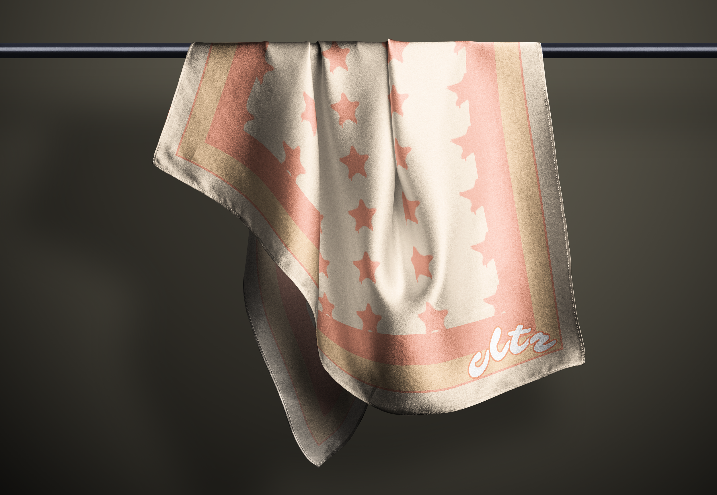
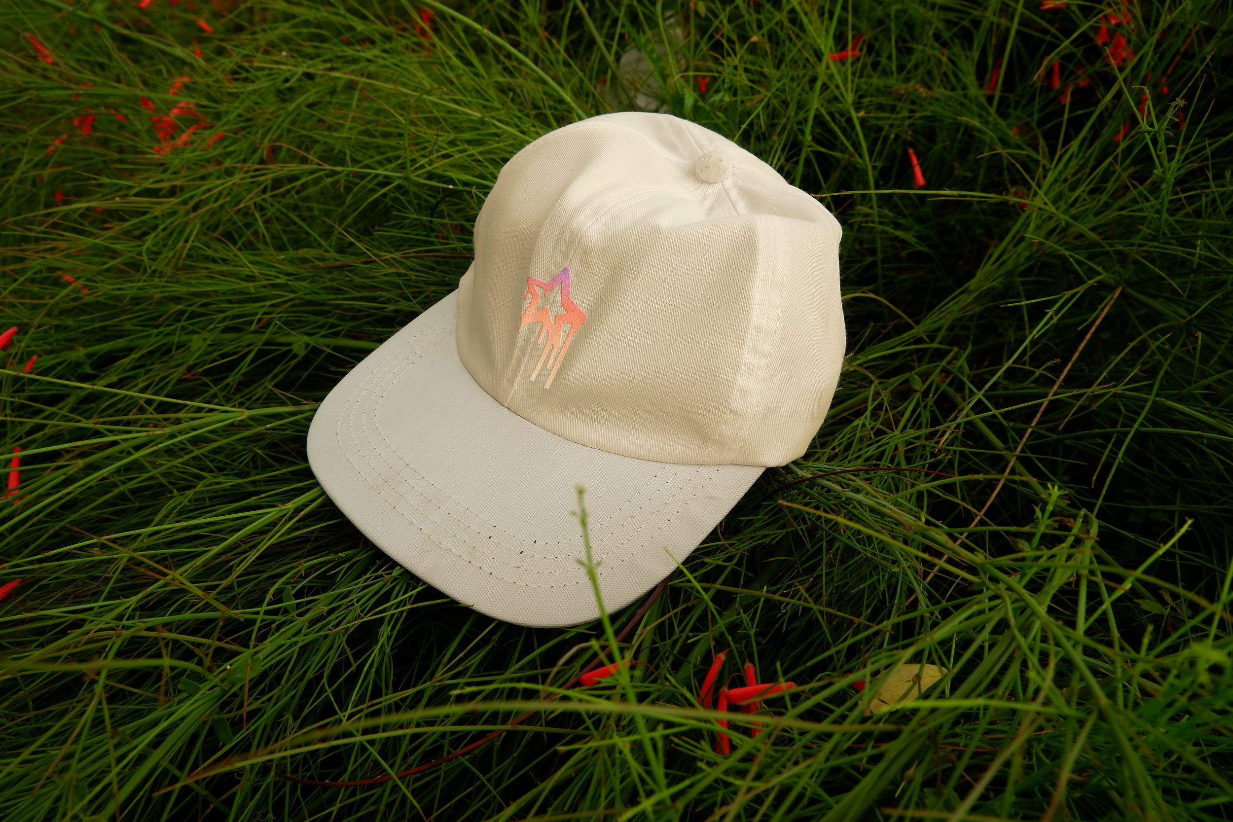
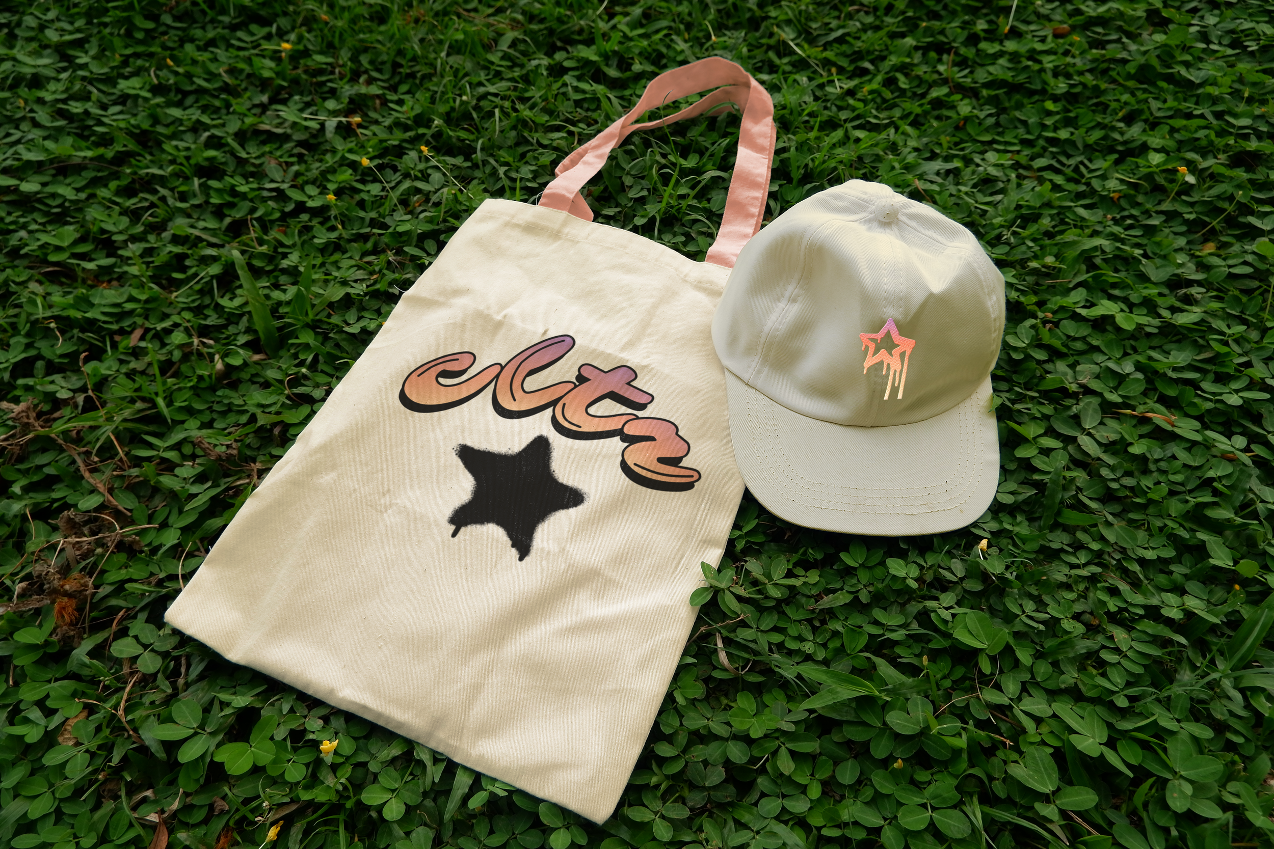
Extending the culture into a wearable movement.
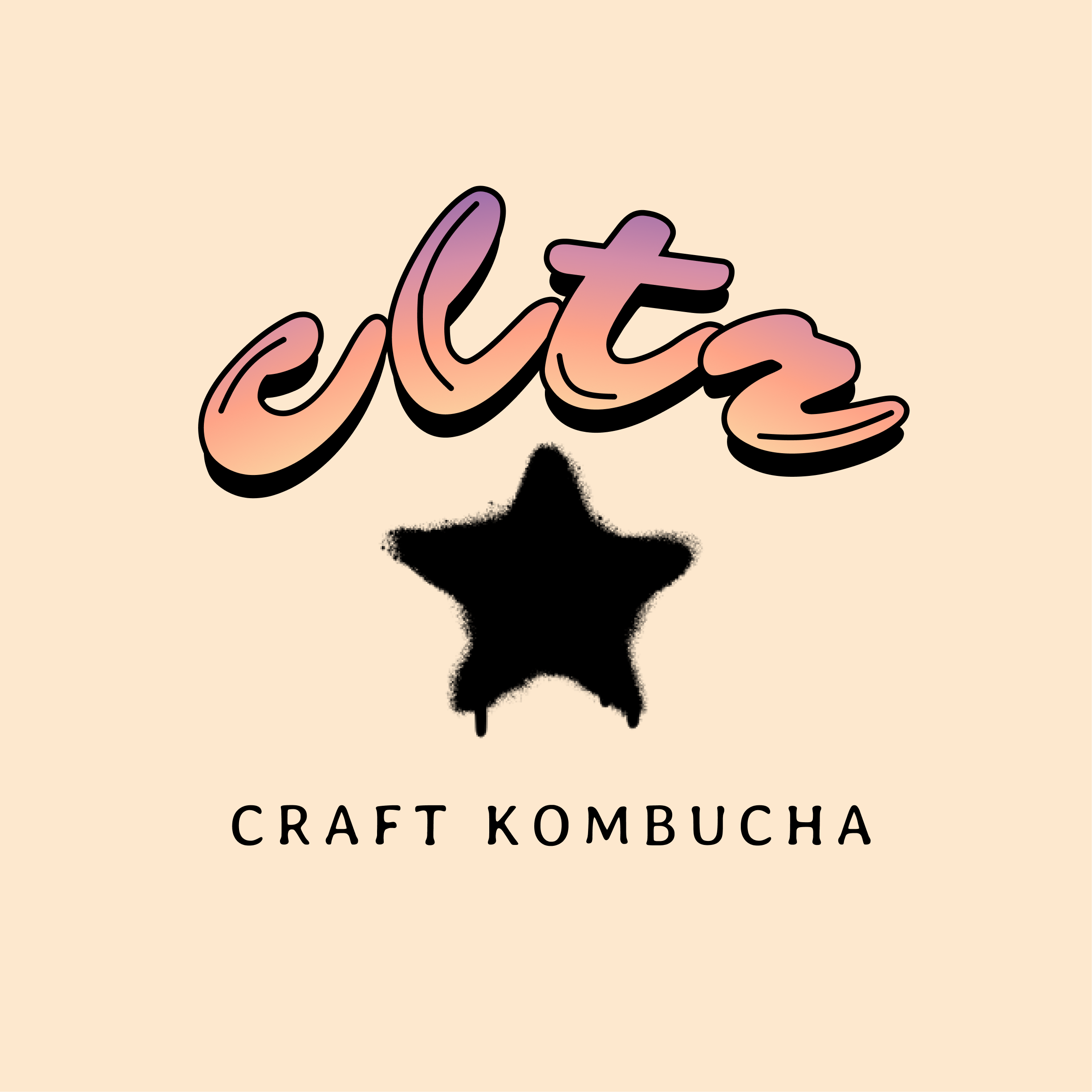
The apparel system extends the brand beyond the can, turning Culture into something people can wear and carry. Pieces like hats, scarves, and totes feature the core star icon, gradient wordmark, and bold “cltr” shorthand, creating graphic statements that feel both casual and collectible. By pushing the identity into fashion-inspired items, the brand positions itself as a part of everyday style and cultural expression.