
UX/UI Design for an internationally recognized University.
My Role:
UX/UI Designer, Copywriter
Tools Used:
Figma, Typescript
Client:
SFU Beedie School of Business
The Beedie Course Navigator is a digital planning tool designed to help SFU Beedie students navigate their degree requirements and plan their academic journey. I redesigned the experience with a focus on simplifying complex information, improving usability, and creating a more intuitive course-planning process.
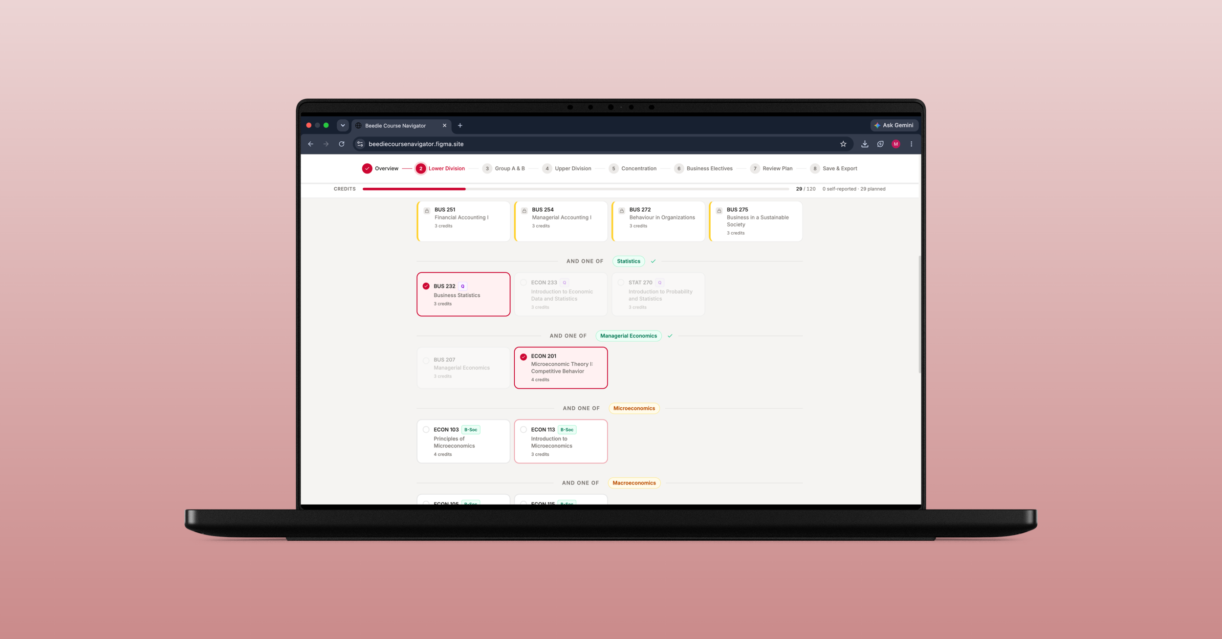
The ChallengeThe existing Course Navigator made it difficult for students to understand their degree requirements and navigate the planning process. Dense information, unclear pathways, and limited guidance created unnecessary friction in an already complex task.
The SolutionI redesigned the experience around a clearer, more guided planning process. The new interface simplifies how students enter their academic progress, understand their requirements, and build their degree plan while making complex information easier to navigate.
Understanding the existing experience.
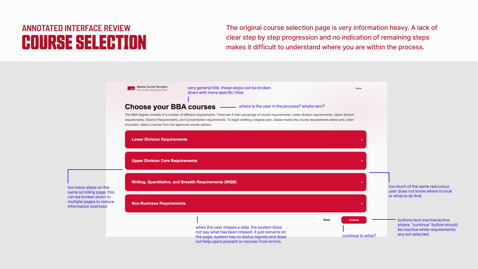
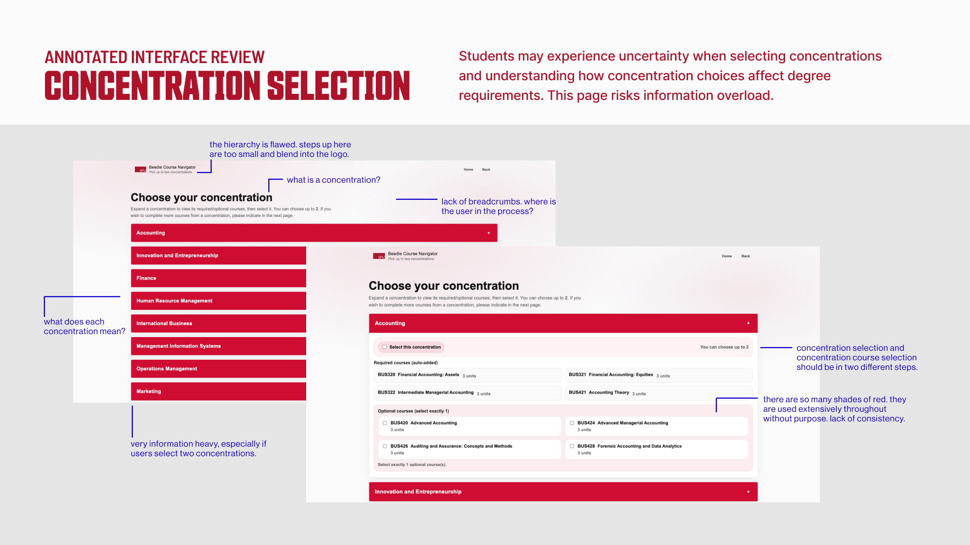
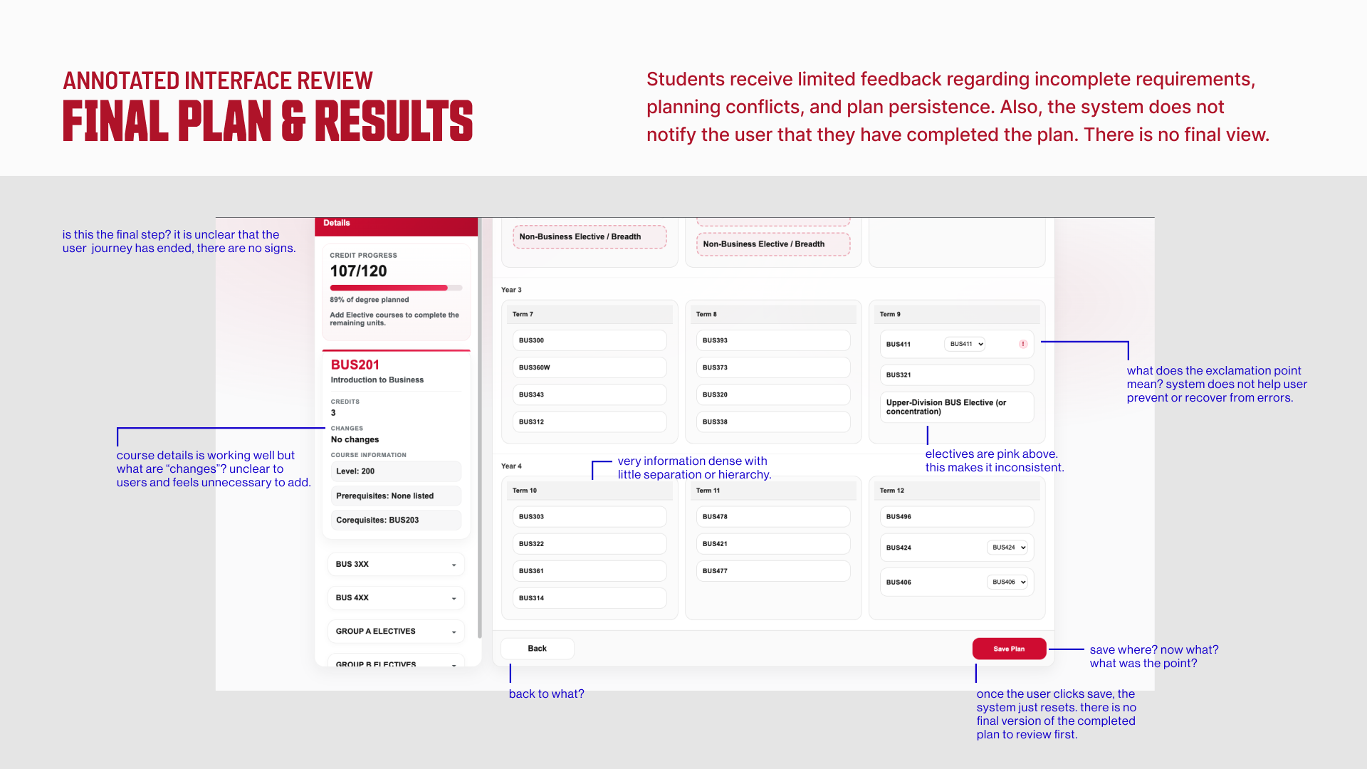
I began by reviewing the existing Course Navigator to understand how students moved through the tool and where the experience could be improved. Through a UX and heuristic review, I identified opportunities to simplify navigation, clarify course and degree information, and create a more guided experience.
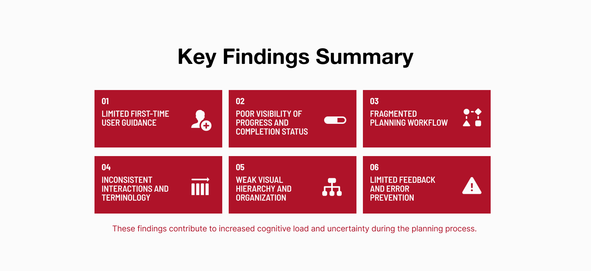
Identifying key opportunities for improvement.
The initial review revealed opportunities to make the Course Navigator clearer, more approachable, and easier to move through. These findings helped establish a set of design priorities that guided the redesign and kept the experience focused on what students needed most.
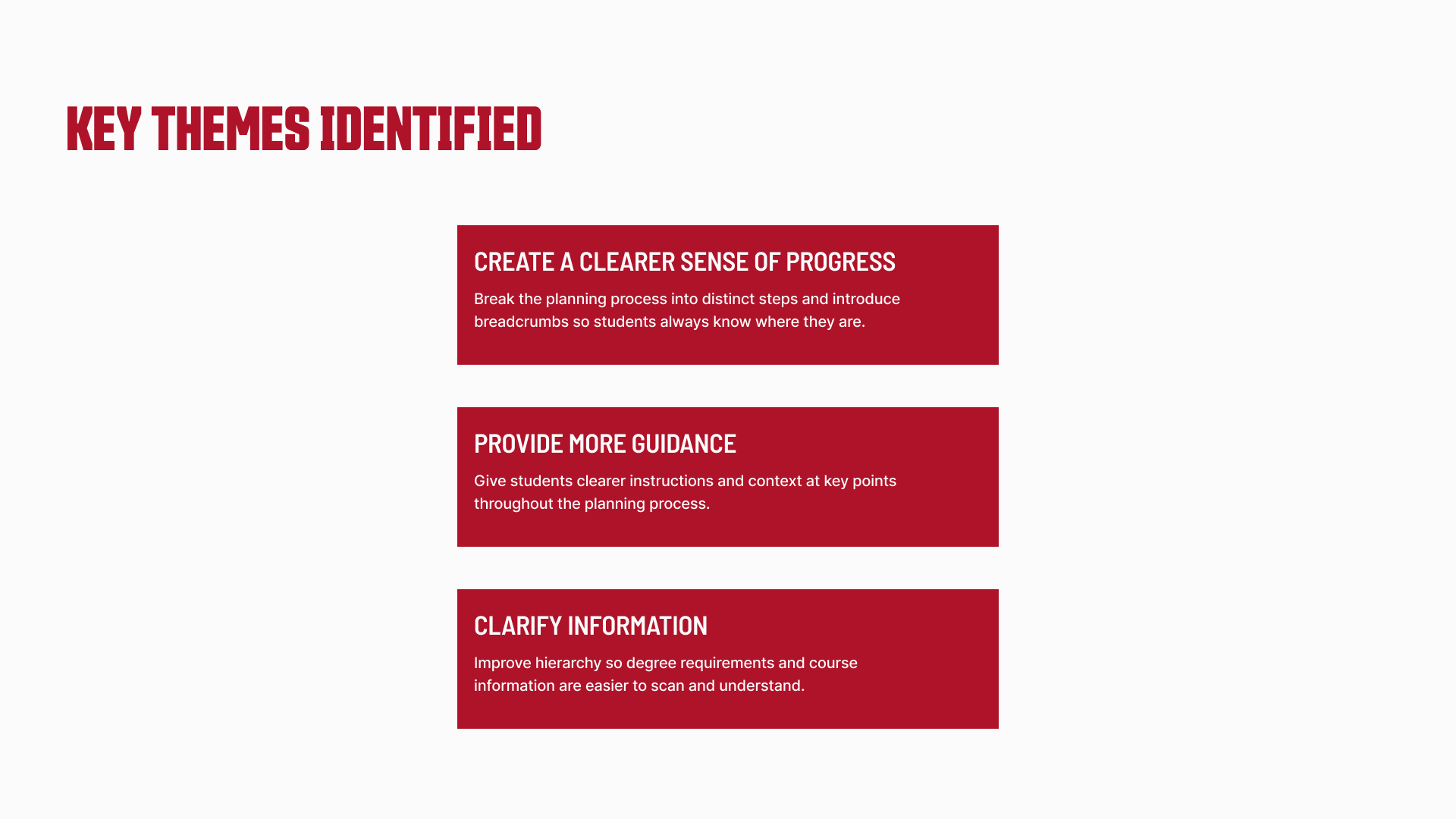
Creating a more guided experience.
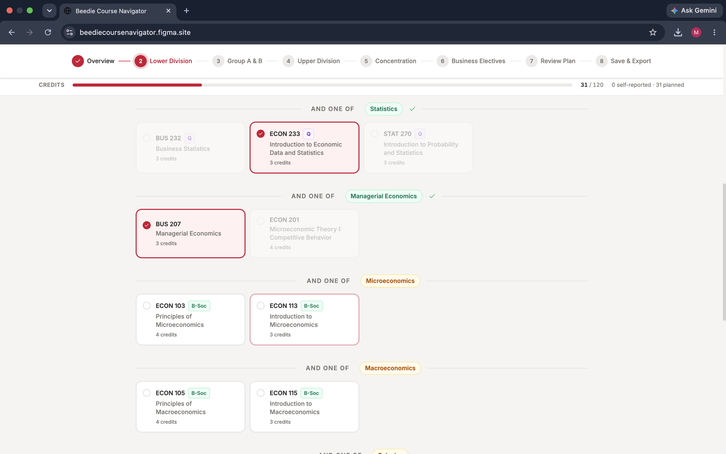
Rather than changing the core planning process, I focused on making each step easier to follow. I introduced clearer entry points, broke complex decisions into more manageable stages, and added breadcrumbs to give students a consistent sense of where they were within the experience.

Redesigning the interface.
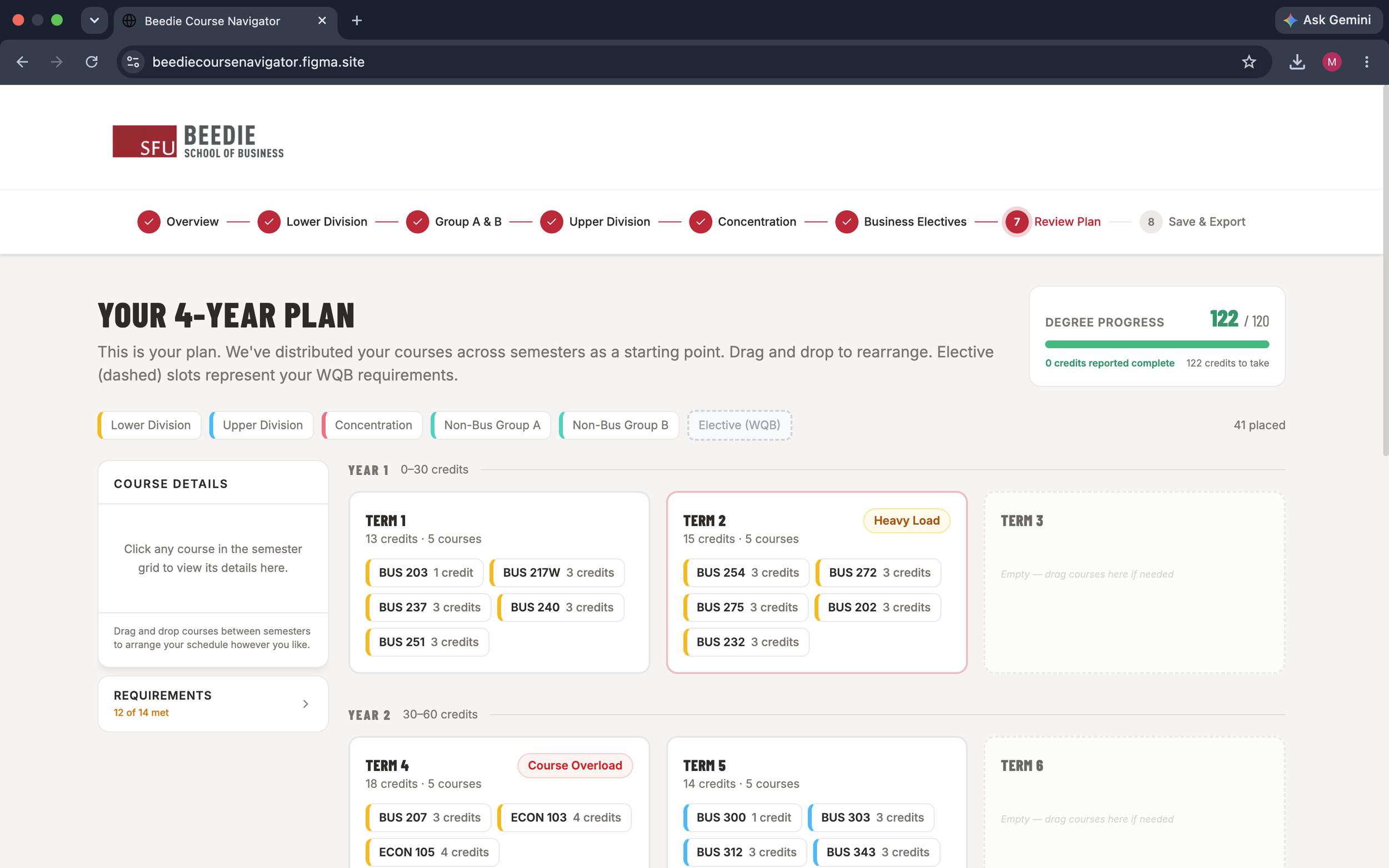
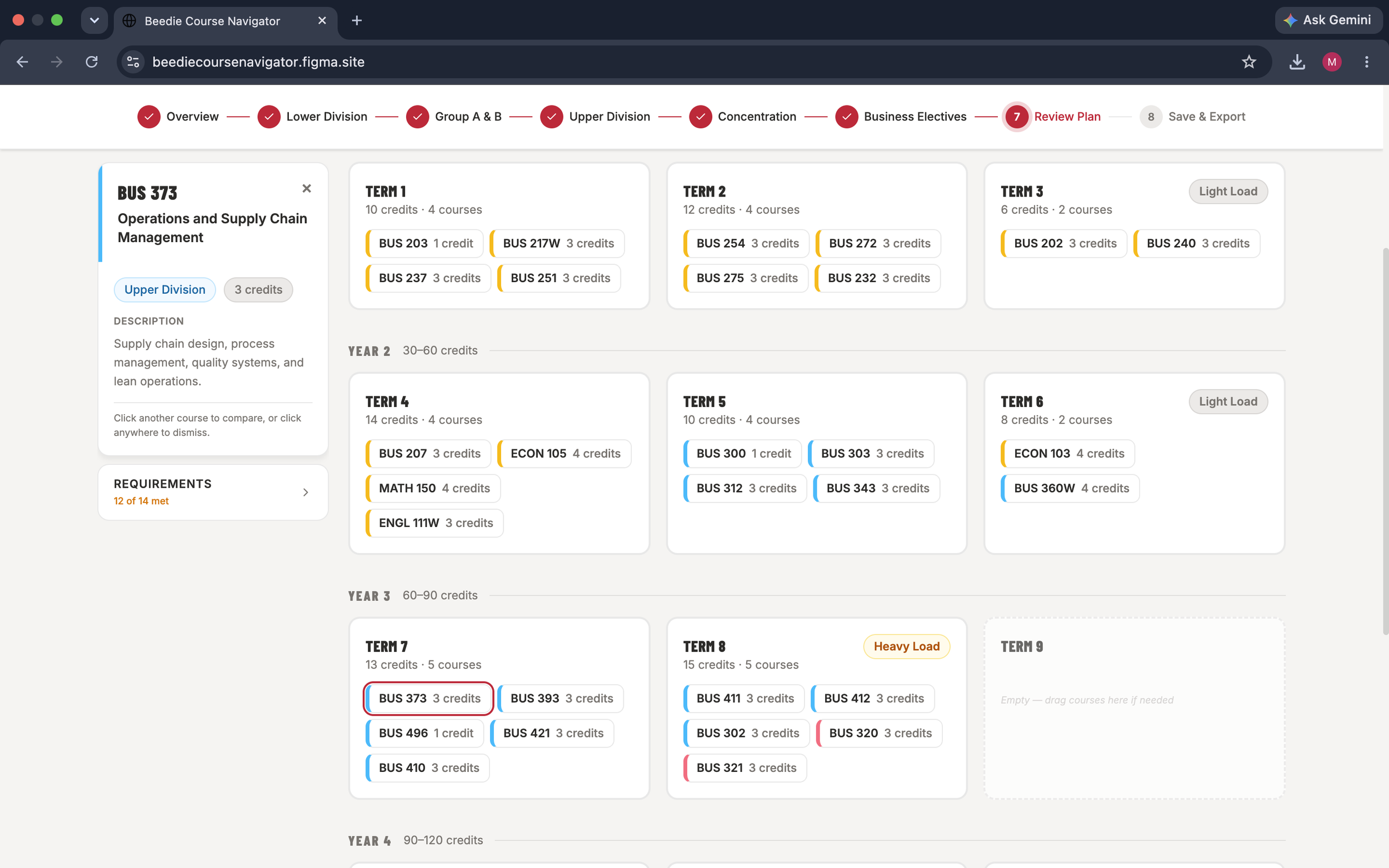
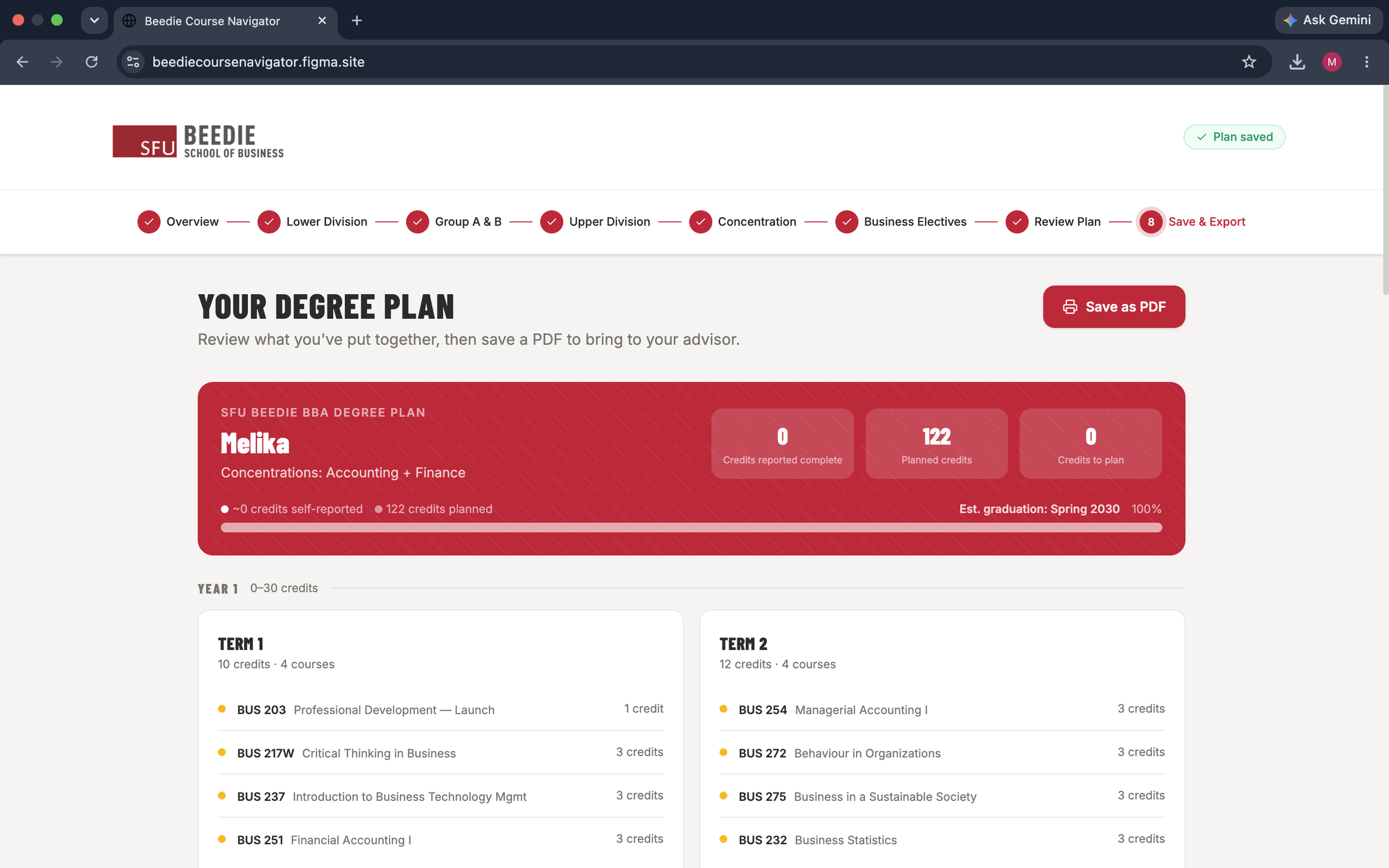
With the experience mapped out, I developed a refreshed interface that made the Course Navigator feel clearer and more approachable. I focused on stronger visual hierarchy, consistent components, and intentional use of typography, colour, and illustration to organize information while staying aligned with SFU Beedie’s visual identity.
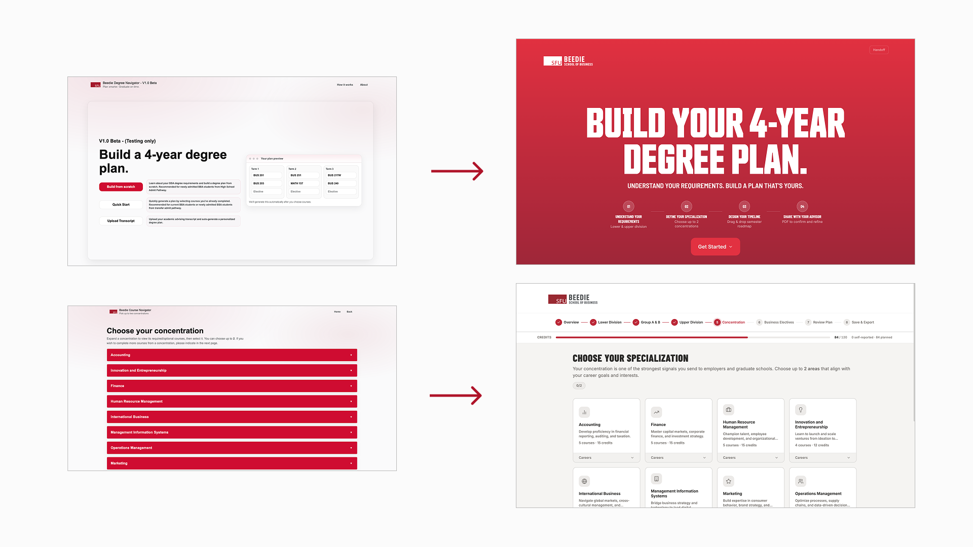
Bringing the experience together.
The final design brings each part of the Course Navigator into a more cohesive experience, from choosing a starting point to reviewing degree progress and planning courses. Clear navigation, consistent visual cues, and guided interactions help students move through the tool with a better understanding of where they are and what comes next.