Art direction and design for a kombucha company.
My Role:
Brand Designer (logo, visual identity development, packaging design, and brand system creation.)
Tools Used:
Adobe Illustrator, Photoshop, Figma, visual research & moodboarding.
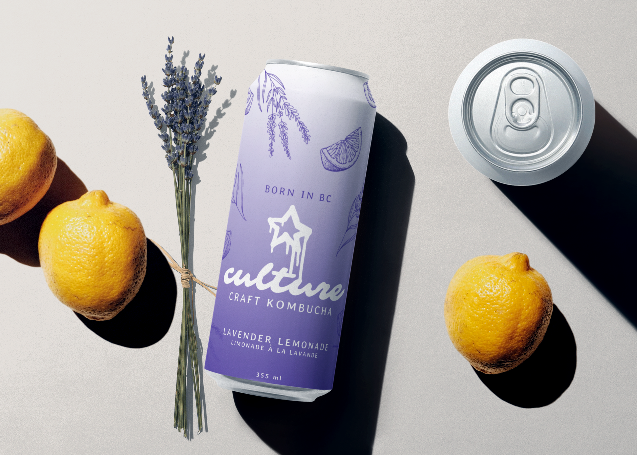
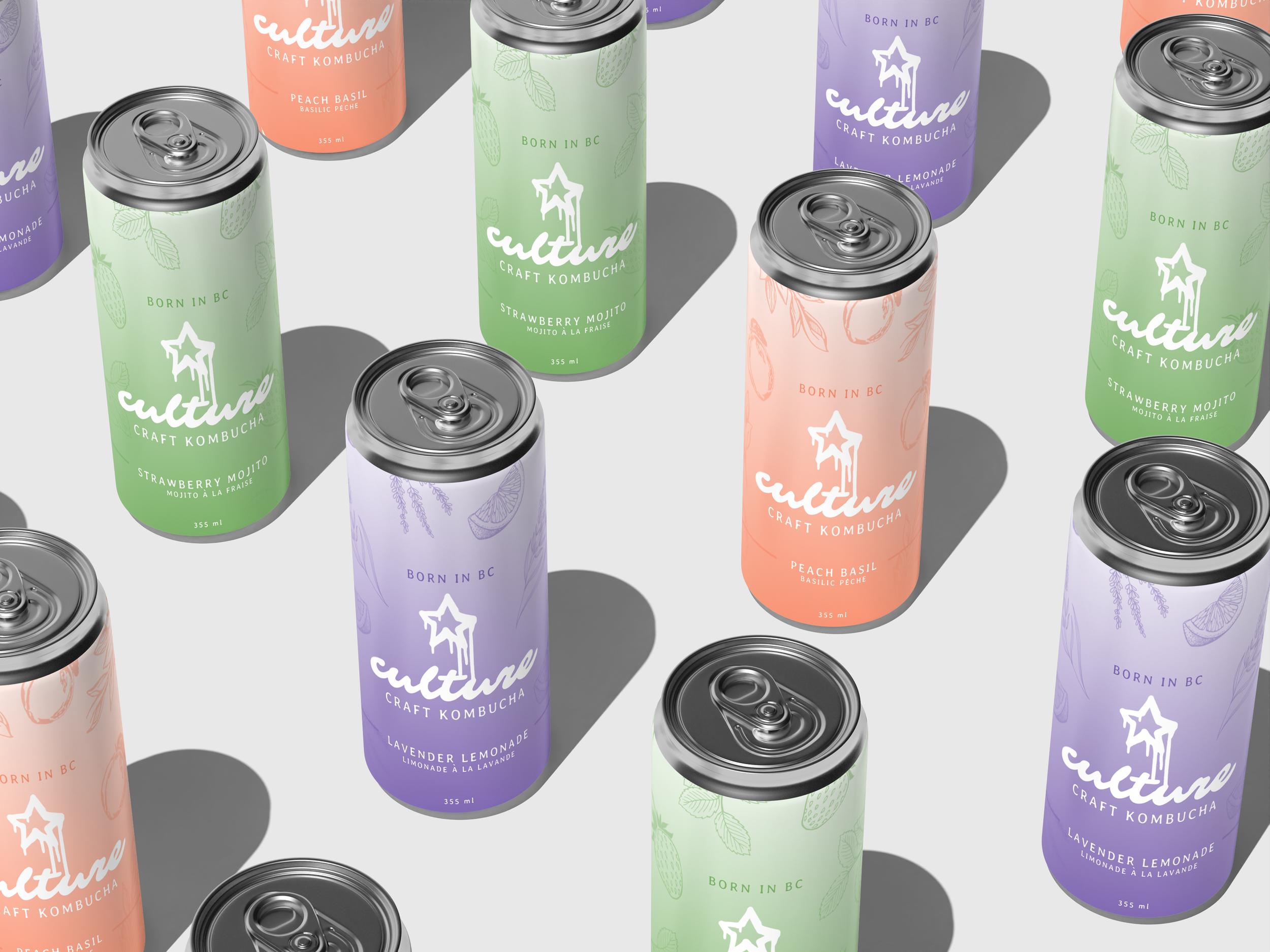
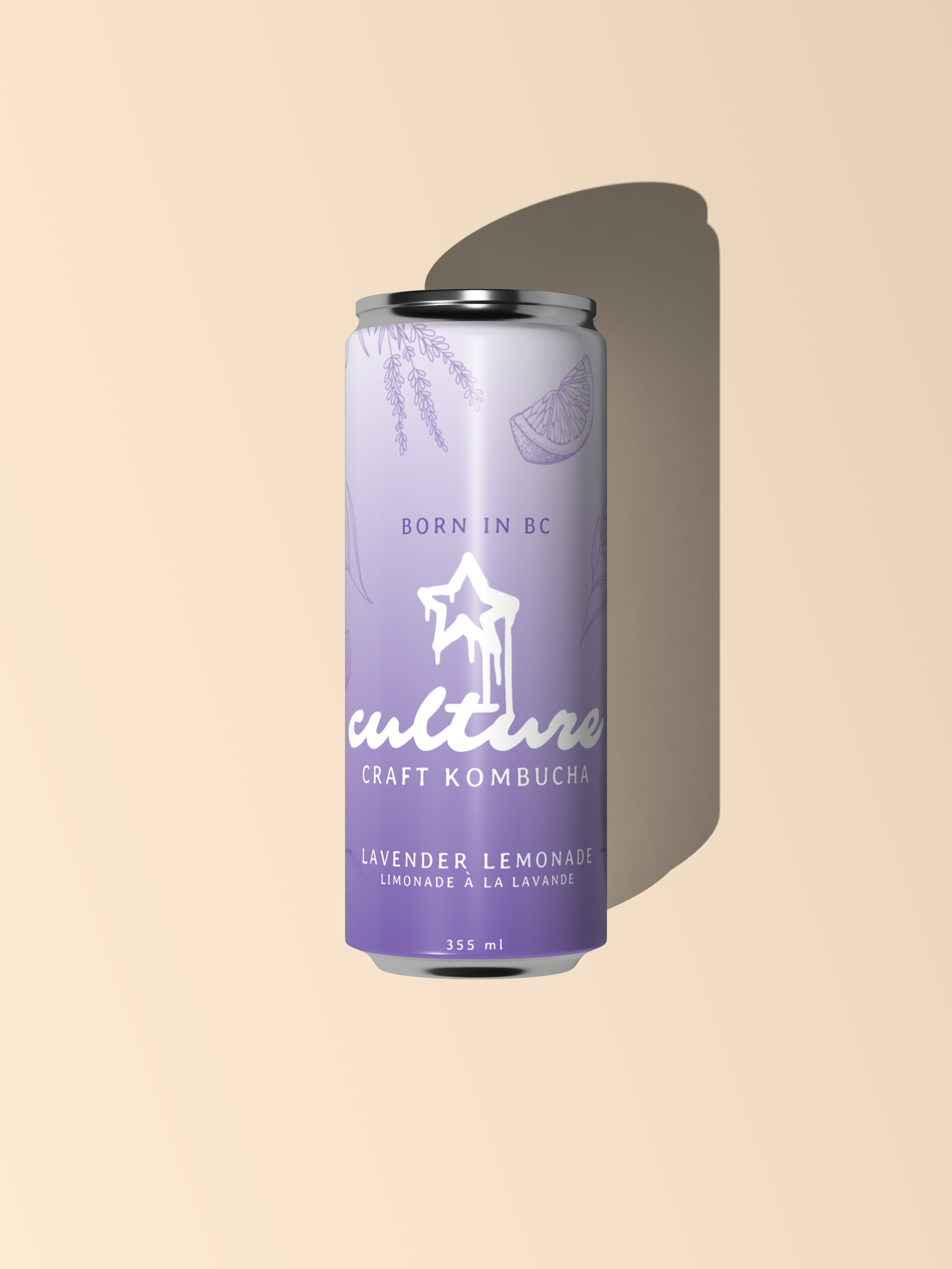
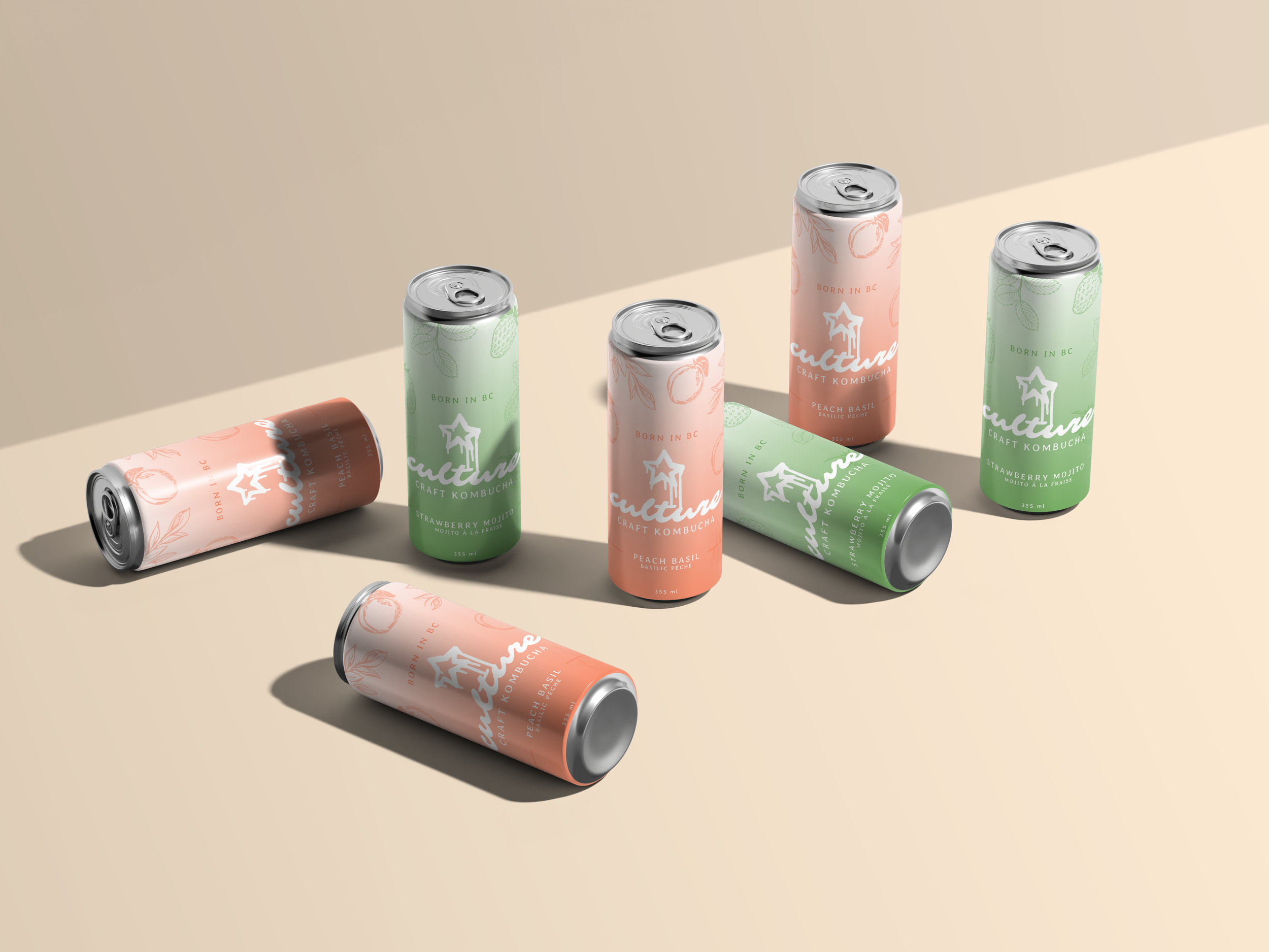
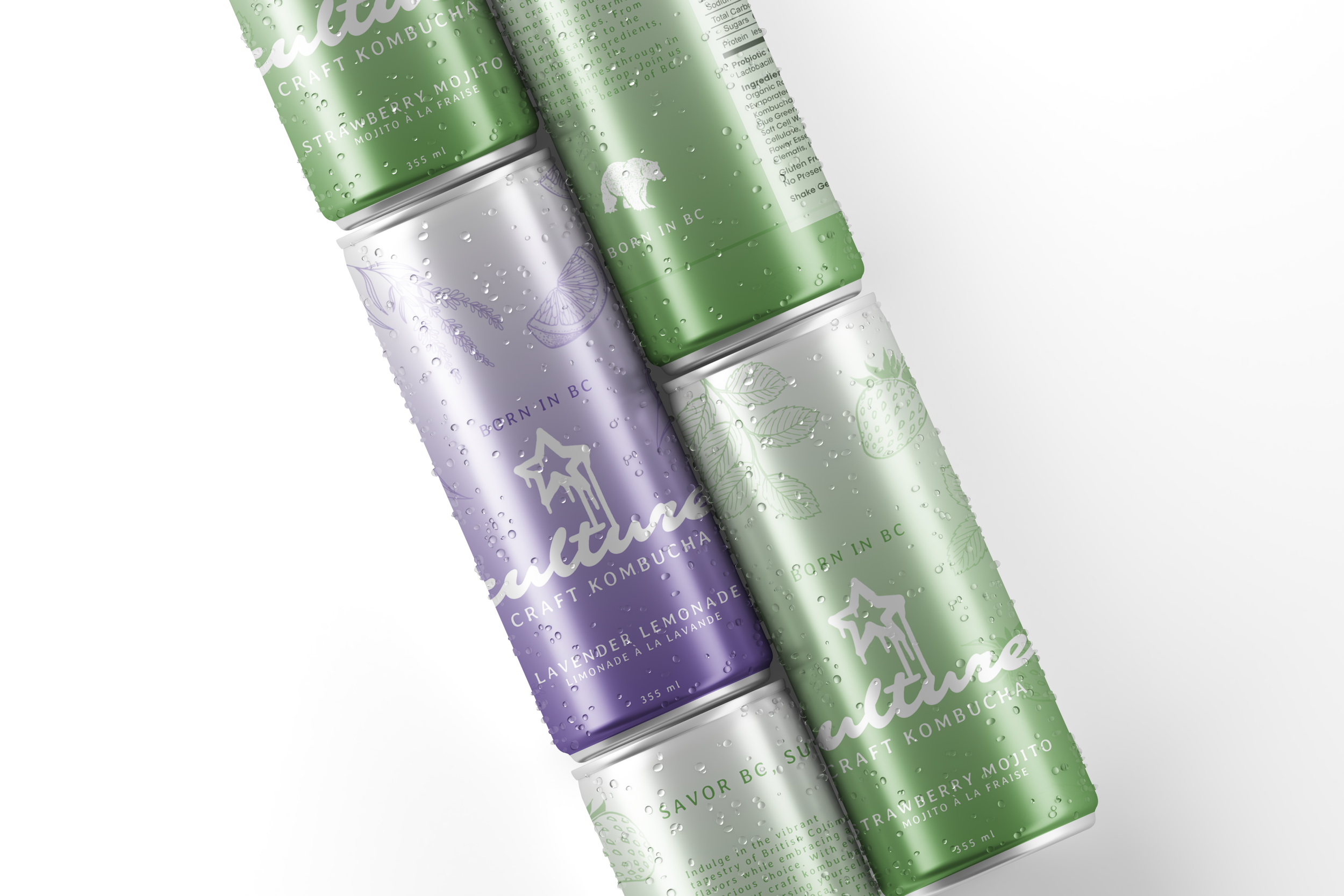
The brand identity for Culture Craft Kombucha uses a pastel color system to differentiate flavours, paired with hand drawn line illustrations of fruits and herbs to signal ingredients. A bold handwritten-style logotype anchors the design, while clean layouts keep the cans modern and easy to read. The art direction emphasizes clarity, consistency, and shelf impact.

The ChallengeTo brand a Vancouver kombucha company in a way that feels crafted, community-driven, and contemporary. Making it stand out in an oversaturated wellness market without relying on generic health or “clean” aesthetics.
The SolutionI developed a warm, approachable brand identity that emphasizes the Vancouver “culture”. Through earthy colors, familiar iconography, and flexible packaging layouts, Culture Craft Kombucha is positioned as a small-batch product that celebrates process, locality, and shared rituals.
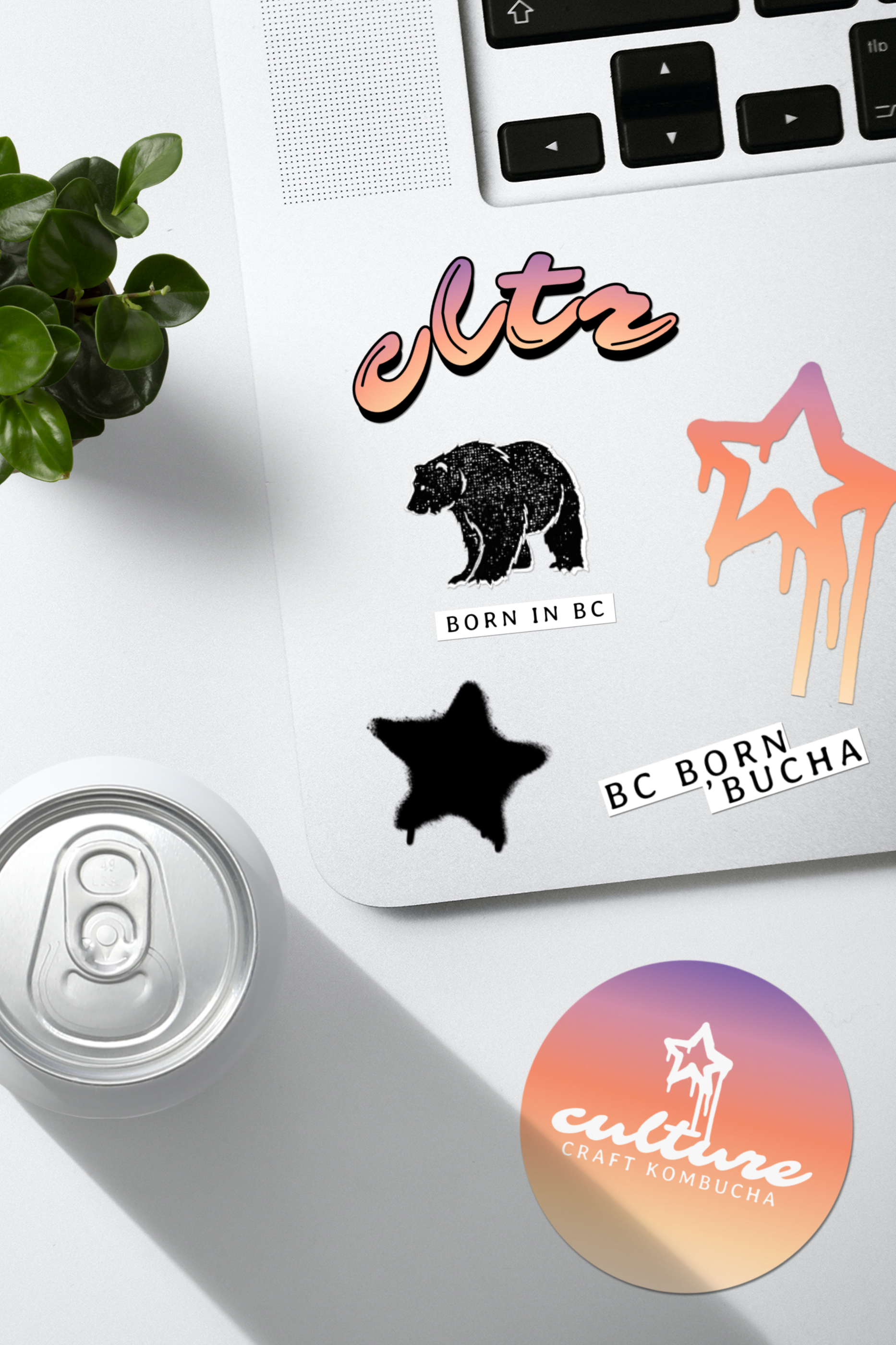
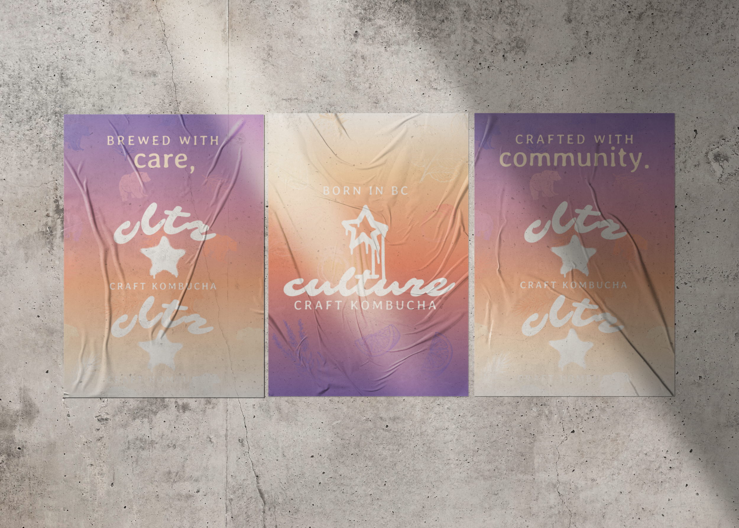
Our cultures star-spangled banner.
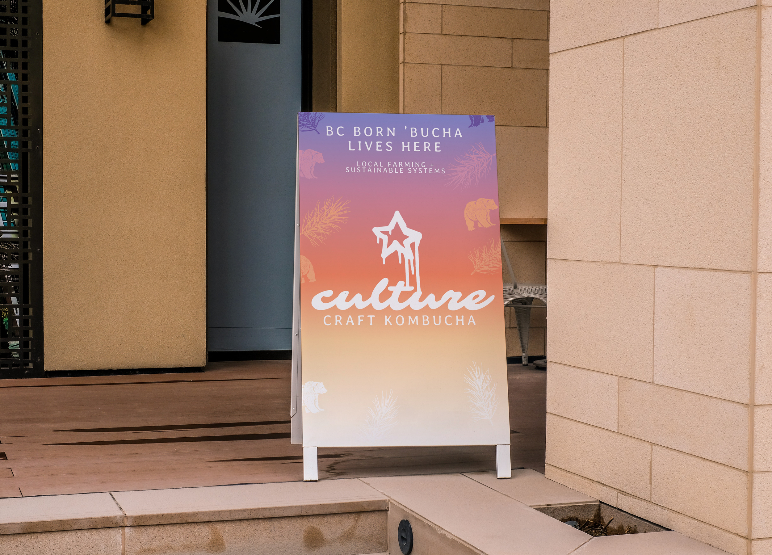
The flag and posters turn the brand into a movement. The star icon and bold logotype are paired with phrases like “For the Culture” and “Crafted with Community” to push the identity.
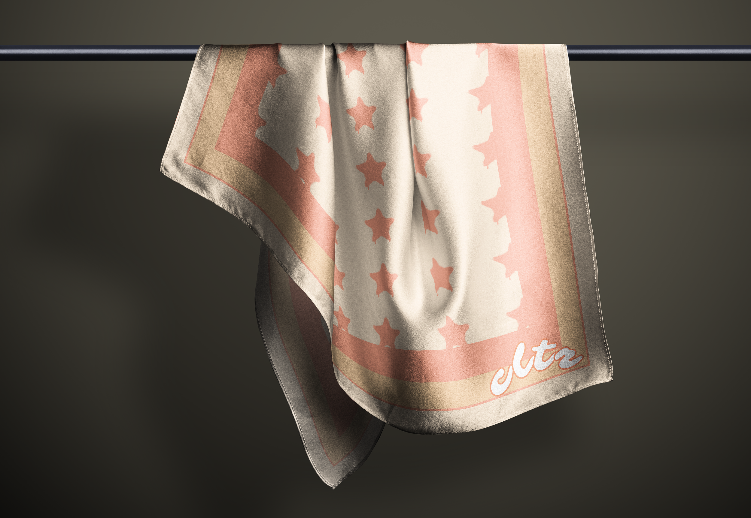
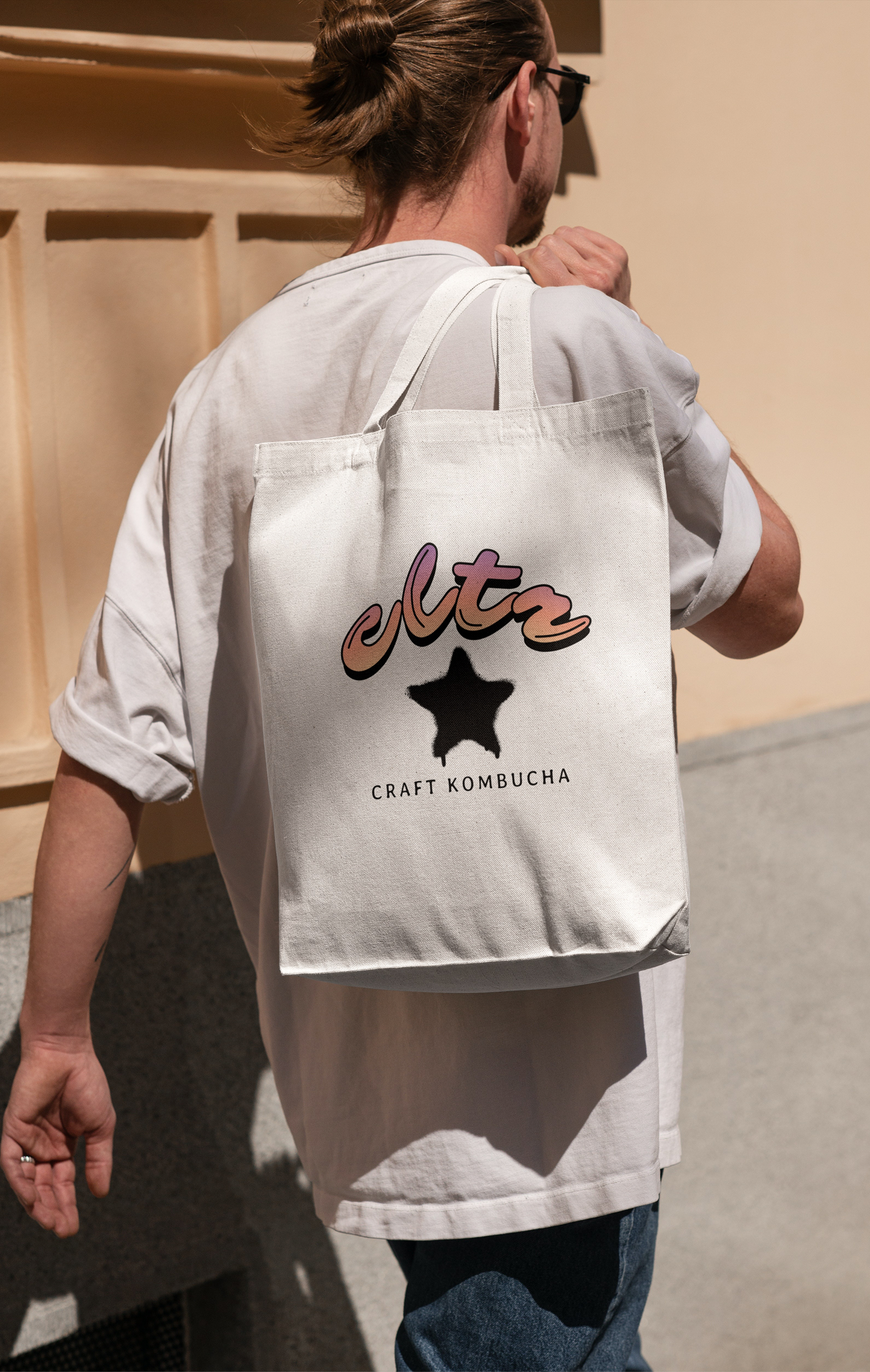
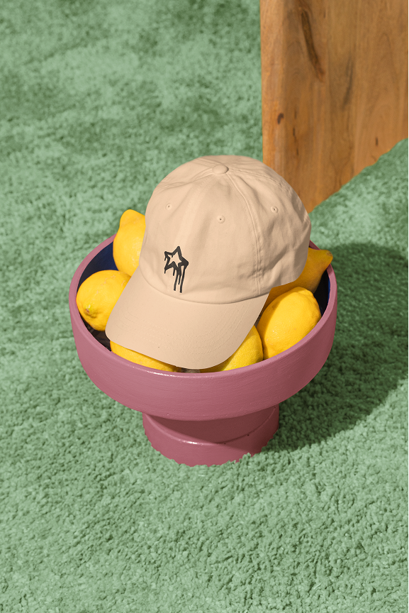
Extending the culture into a wearable movement.
The apparel system extends the brand beyond the can, turning Culture into something people can wear and carry. Pieces like hats, scarves, and totes feature the core star icon, gradient wordmark, and bold “cltr” shorthand, creating graphic statements that feel both casual and collectible.