Branding & microsite for Fuori Salone at Milano Design Week.
My Role:
UX/UI & Visual Designer (concept development, visual identity creation, poster design, and microsite UI.)
Tools Used:
Adobe Illustrator, InDesign, Photoshop, Figma
This project explores a speculative visual identity for Fuori Salone during Milan Design Week, spanning posters, event branding, and a responsive microsite. The goal was to capture the energy, experimentation, and cultural density of the city during design week while maintaining a cohesive system across print and digital platforms. Through bold typography, modular layouts, and a flexible graphic language, the identity reflects the movement and overlap of ideas that define Fuori Salone.
The ChallengeTo create a cohesive visual identity for a city-wide design event that spans multiple mediums (posters, branding, and a microsite) while capturing the energy, scale, and creativity of Milano Design Week.
The SolutionI developed a flexible design system that translates seamlessly across print and digital, allowing the identity to feel energetic, contemporary, and consistent throughout all touchpoints, while encouraging event attendance.
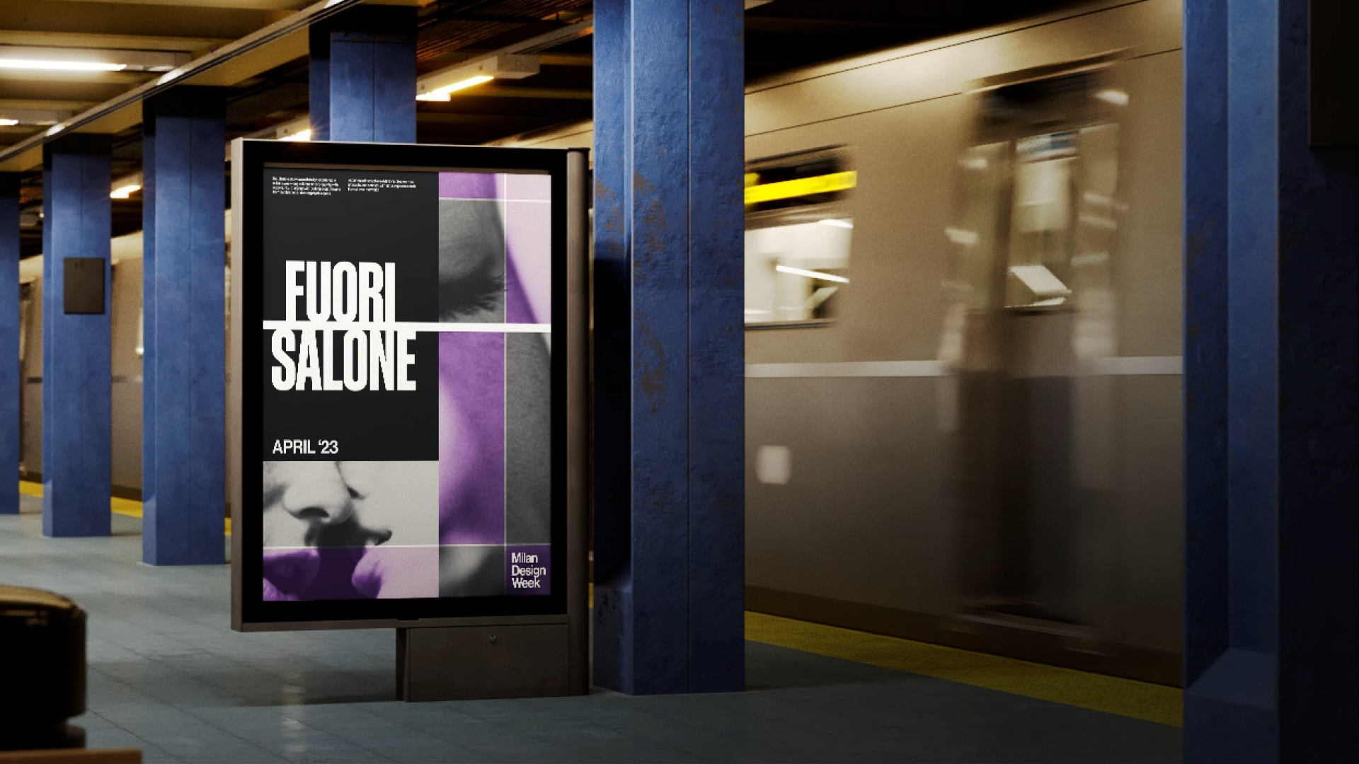
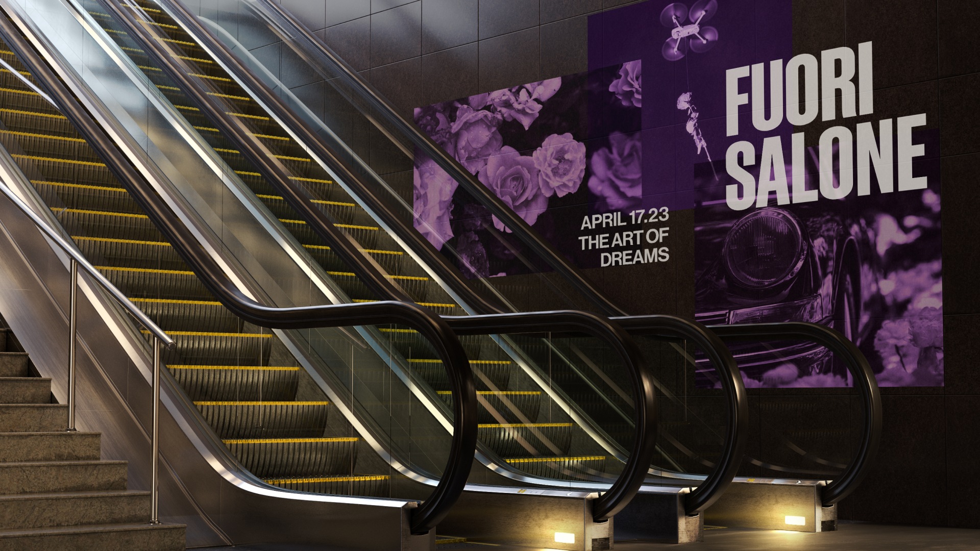
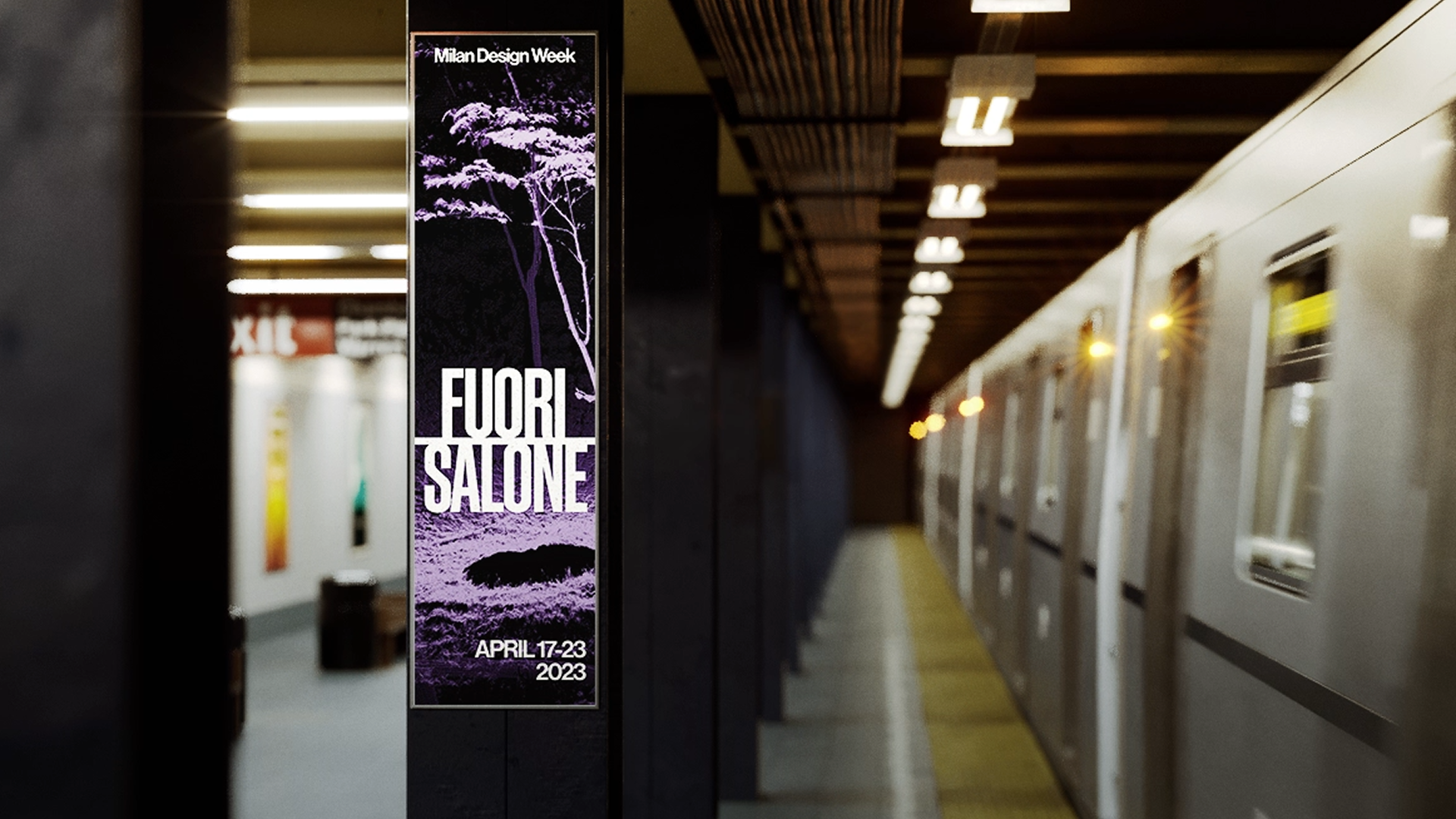
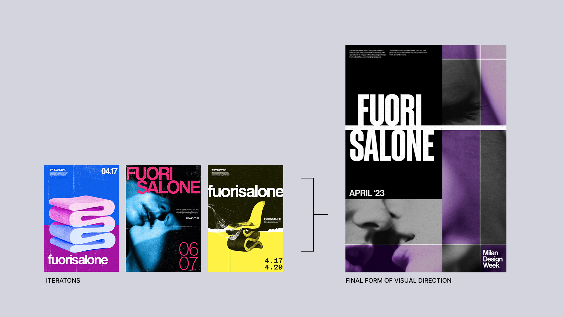
Identity exploration through poster design.
I began by exploring the visual identity of the exhibition through a series of poster concepts. This phase focused on experimenting with typography, colour, and imagery to capture the essence of the event while defining a distinctive, cohesive aesthetic. The posters allowed me to push creative boundaries and test different approaches before finalizing the branding system.
Focusing on user objectives to spark interest before the event.
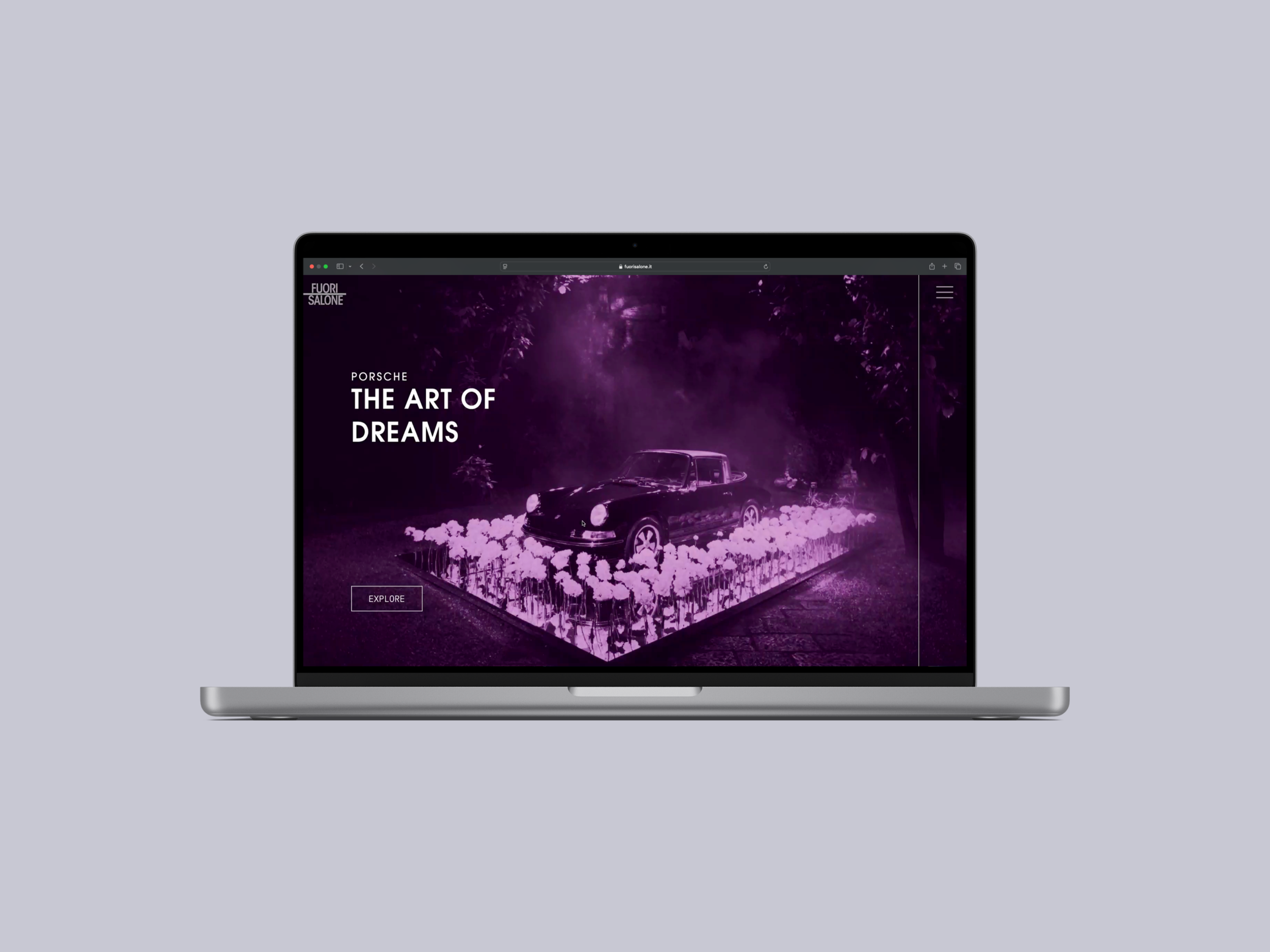
The microsite is designed to engage users with a narrative-driven preview of Fuorisalone Milano. Users should be able to explore key aspects of the exhibition, gain insight into its themes, and feel intrigued to attend, without revealing the full experience. The platform serves as a pre-event introduction, guiding users through the story of the exhibition while sparking curiosity and anticipation.
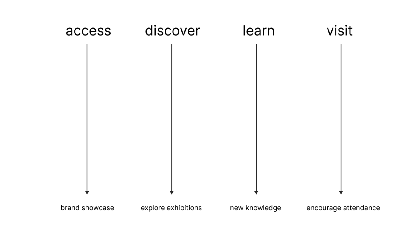
Shaping the user’s pre-event journey.
The user journey is structured around progressive disclosure, guiding visitors from introduction to action. It begins with an animated entry point that establishes brand identity, followed by interactive discovery through hover-based exploration. Users then transition into a narrative-driven exhibition page designed for immersive learning. The experience concludes with a clear call to action, encouraging registration.
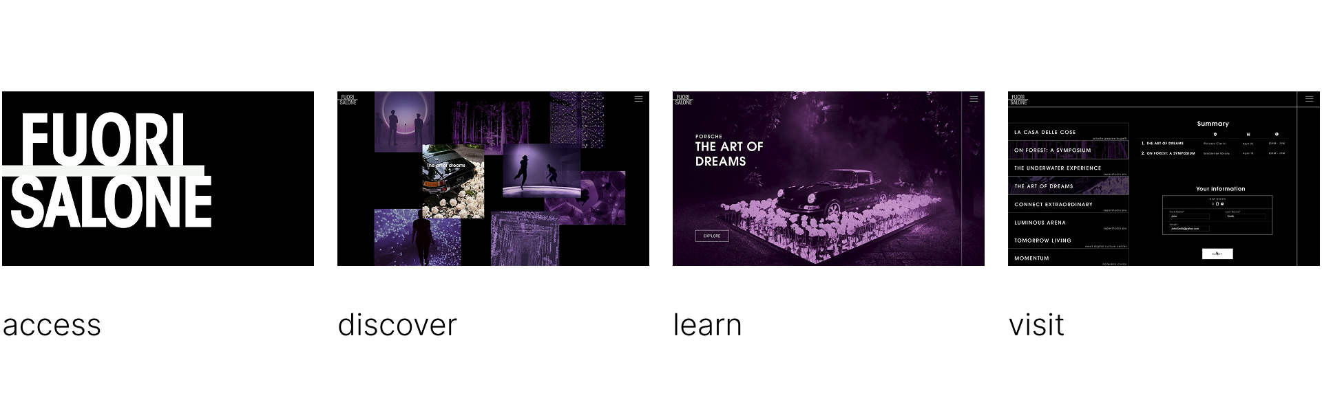
Landing page greets users with animation.

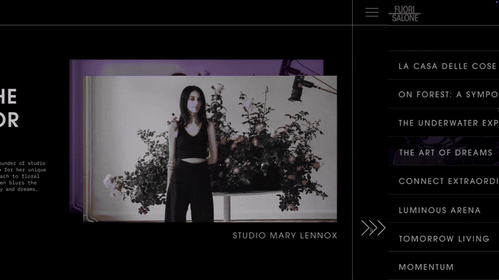
Hover to reveal exhibition details and select one to explore further.
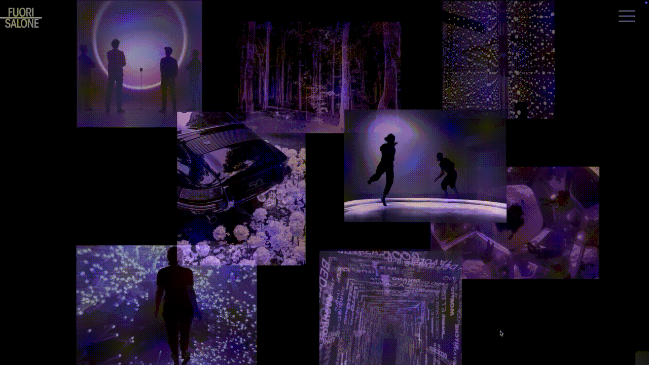
A purple underlay indicates hover-activated elements, allowing users to hover over images for a reveal.
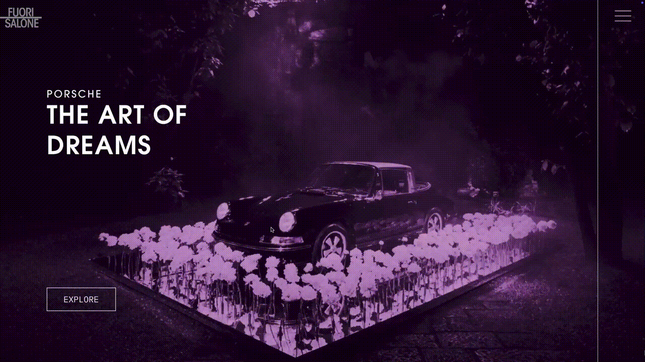
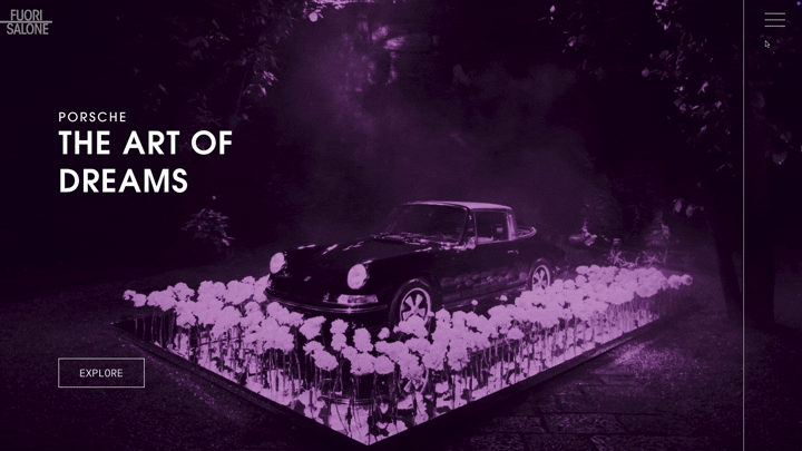
A horizontally navigated website accessed through click-based interactions.
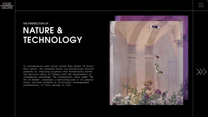
Visitors can gain insight into the creator behind each exhibition.
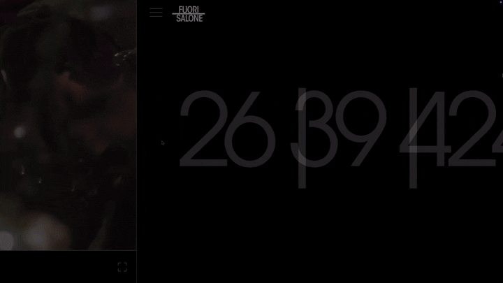
At the end of the experience, visitors can use a hover-activated calendar to register for the guestlist.
Top-right menu icon lets visitors access featured exhibits and directly register for the guestlist.
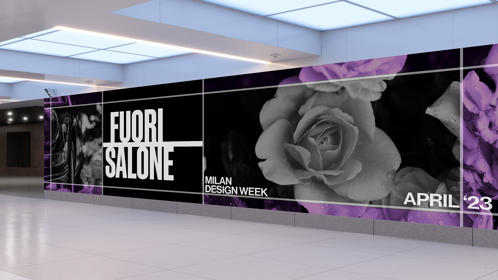
The final artistic direction.
We landed on our final graphic representation as it allowed for a transition to web forms. The grid structure and color choice became the foundation for our brand DNA and our means for story telling on the site. The branding was placed around the city to capture attention and engage visitors.