
City of Vancouver earthquake safety design for renters.
My Role:
UX/UI Designer & Visual Communication Lead
Tools Used:
Adobe Illustrator, Photoshop, Figma, Procreate
I designed a renter-focused earthquake preparedness system in collaboration with the City of Vancouver, using multilingual, icon-driven posters placed in shared building spaces like elevators. Each poster directs users to a simple microsite with clear, visual guidance on low-effort safety actions designed specifically for renters who can’t make structural changes. Prioritizes accessibility, clarity, and real-world constraints to make preparedness more actionable.

The ChallengeEarthquake preparedness resources are often designed for homeowners, leaving renters (who can’t make structural changes) with unclear, inaccessible guidance on how to stay safe in their own spaces.
We asked:
What barriers prevent tenants in the City of Vancouver from taking earthquake preparedness actions in multi-unit rental housing?
We found:
01
Renters feel less prepared for disasters than homeowners due to limited control over their living space and uncertainty about which preparedness actions require landlord approval.
02
Earthquake injuries are more often caused by falling household objects, meaning interior hazards such as unsecured furniture and unsafe room layouts are a primary source of risk.
Preparedness information is more likely to be noticed and understood when delivered in unavoidable spaces like elevators, where residents have fewer distractions.
03
The SolutionA renter-focused poster system placed in high-traffic building areas, paired with a QR-linked microsite that delivers simple, multilingual, and actionable safety steps tailored to real apartment living constraints.
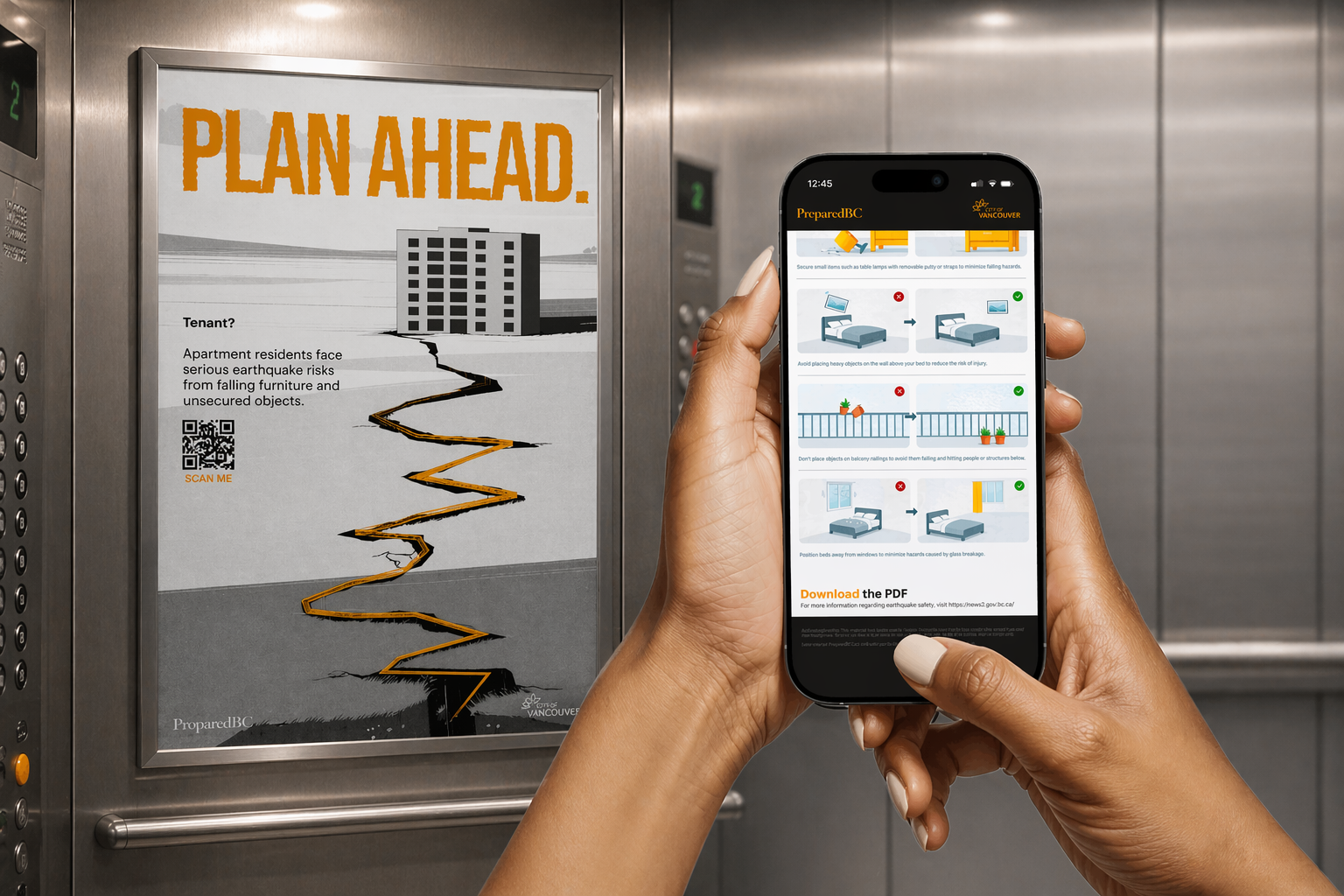
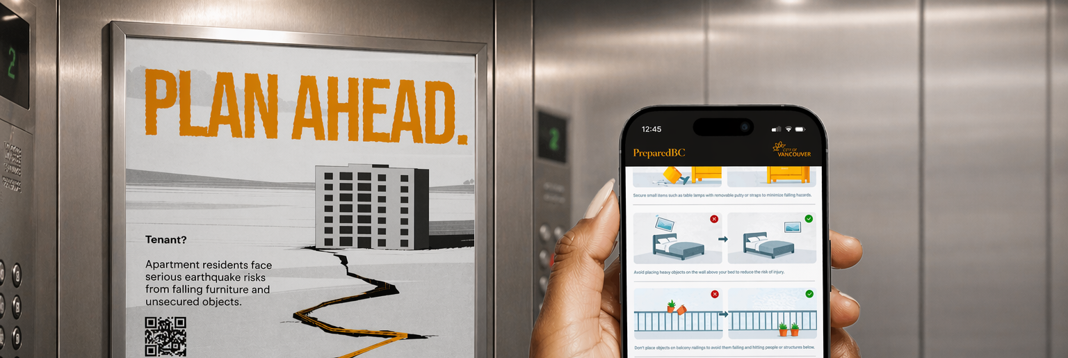
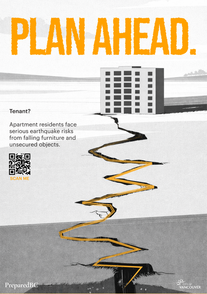
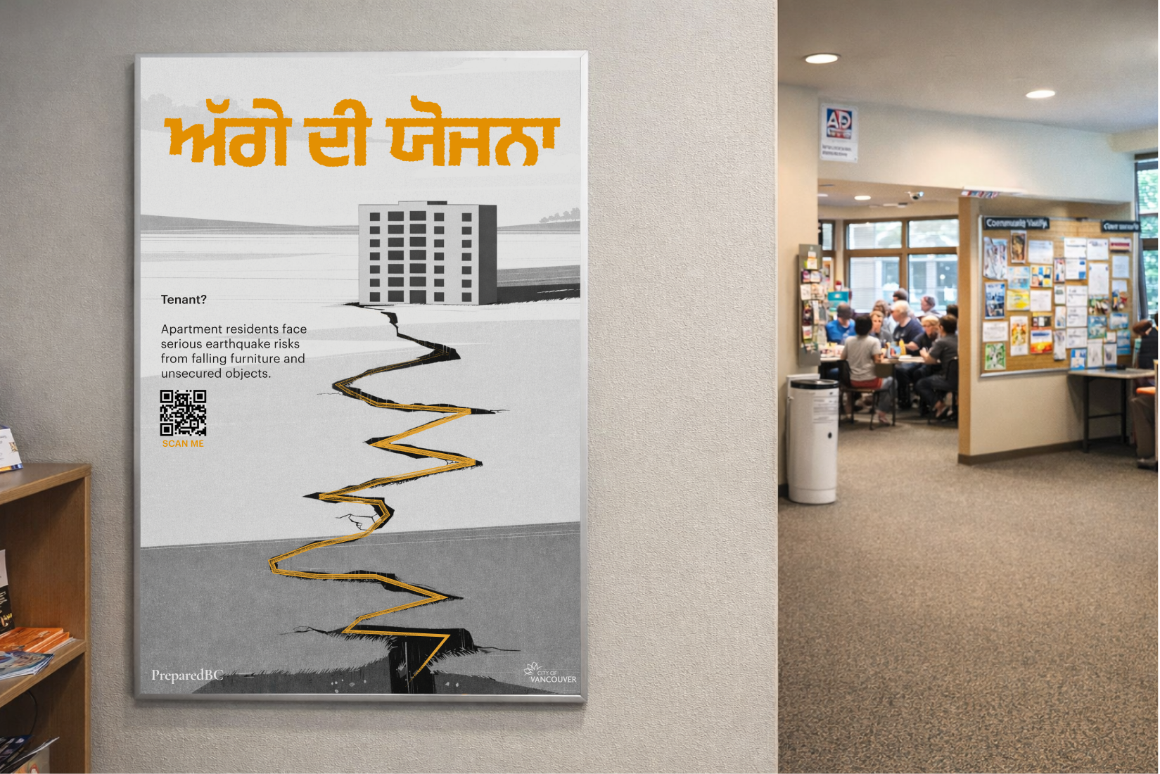
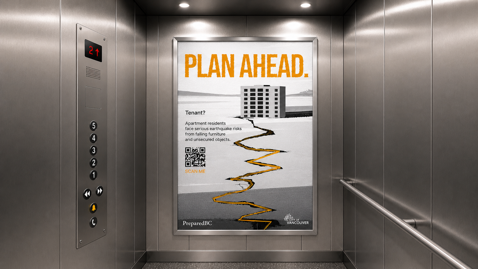
Poster discovery in high-traffic shared spaces.
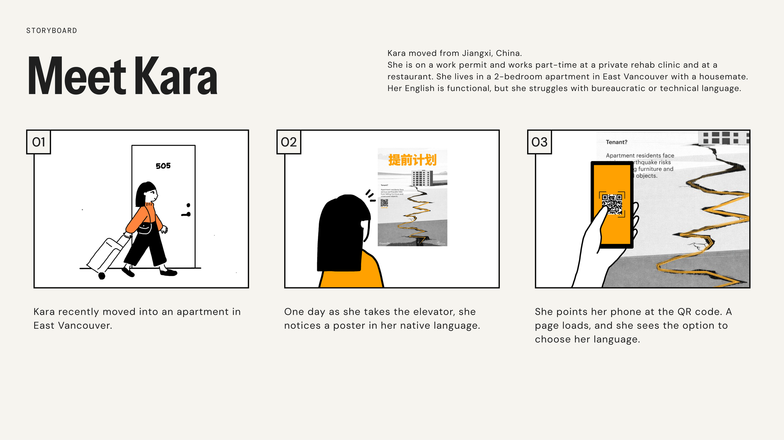
The solution begins with a bold poster placed in high-traffic, unavoidable areas like elevators, designed for quick, clear understanding. Strong visual hierarchy and minimal text communicate urgency at a glance and prompt action. Multilingual versions help diverse residents connect with the message and increase QR code engagement.
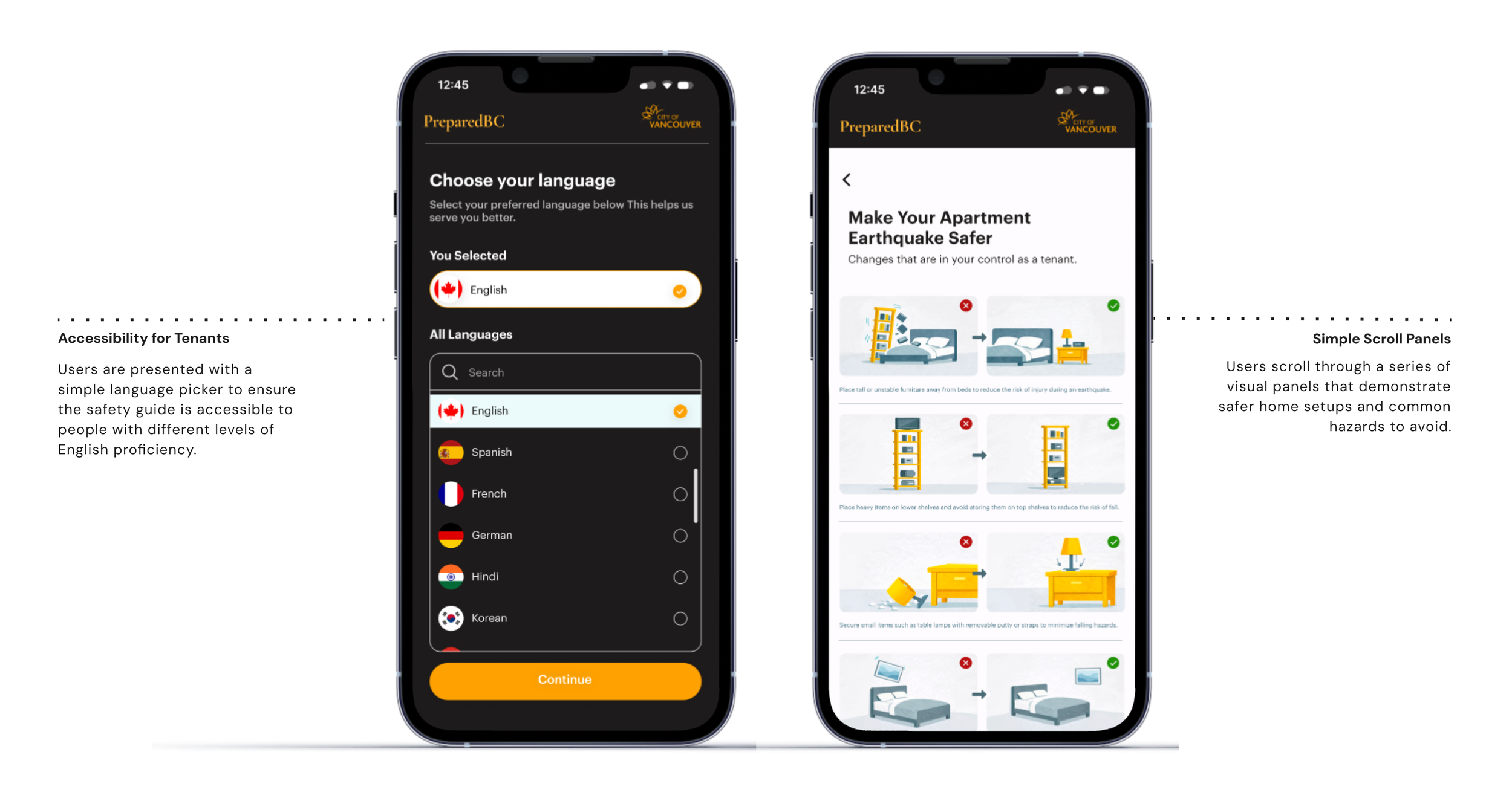
Microsite delivers clear, actionable guidance.
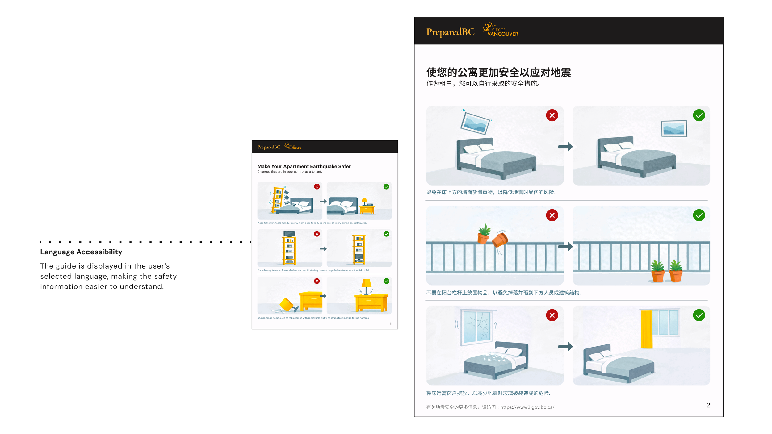
Scanning the QR code leads to a simple, mobile-first microsite that translates preparedness into clear, visual steps. Information is broken down into quick, digestible actions, focused on reducing everyday risks like unsecured furniture. Users can easily understand and apply them. Designed with minimal text and intuitive navigation, the site reinforces accessibility and supports multiple languages.
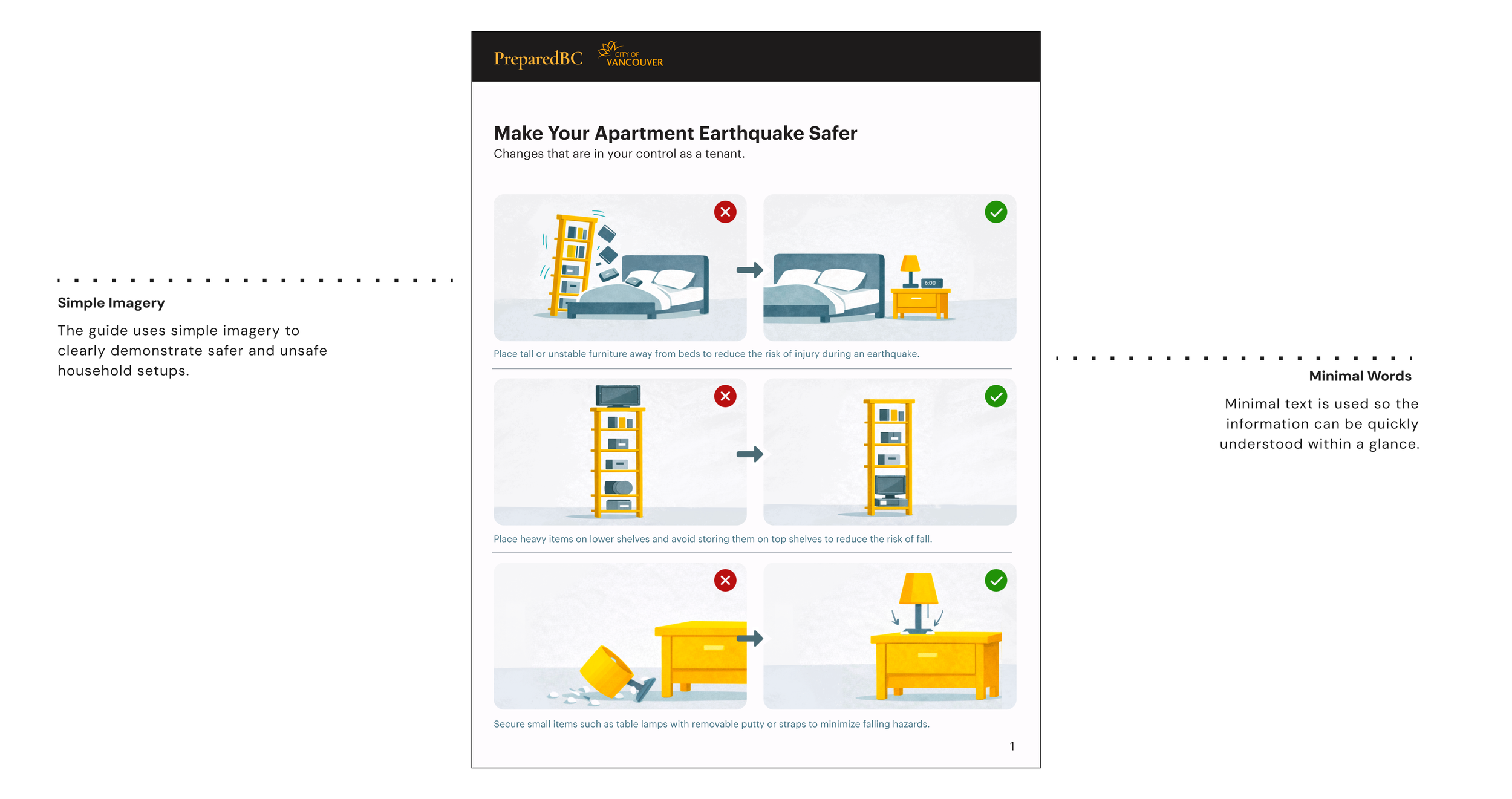
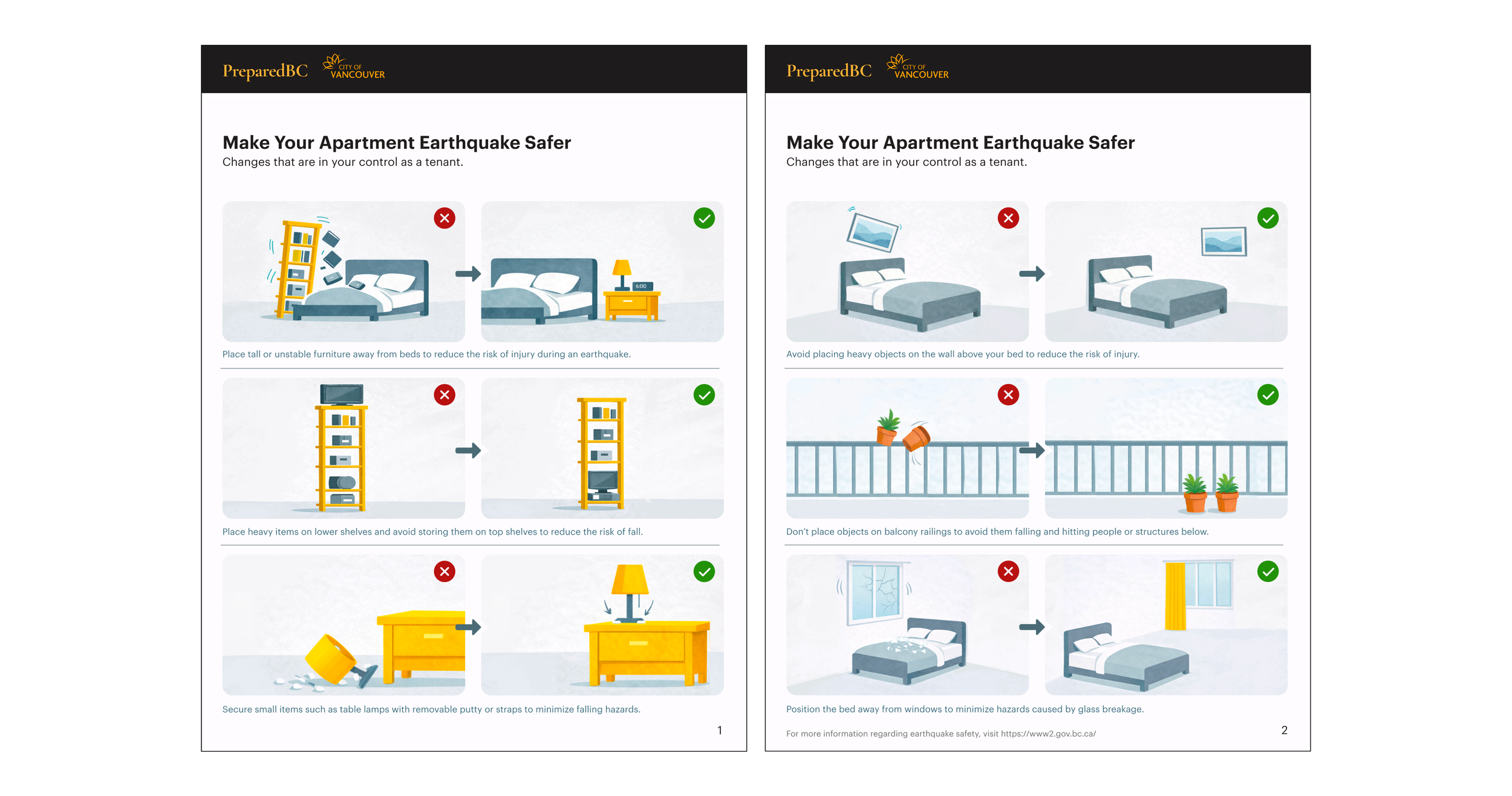
Visual system simplifies complex safety actions.
The guide uses simple, side-by-side visuals to clearly show safe and unsafe setups, making information easy to understand at a glance. By relying on imagery over text, it communicates key actions quickly and reduces language barriers. Minimal wording supports clarity while keeping the focus on practical, everyday changes renters can make.
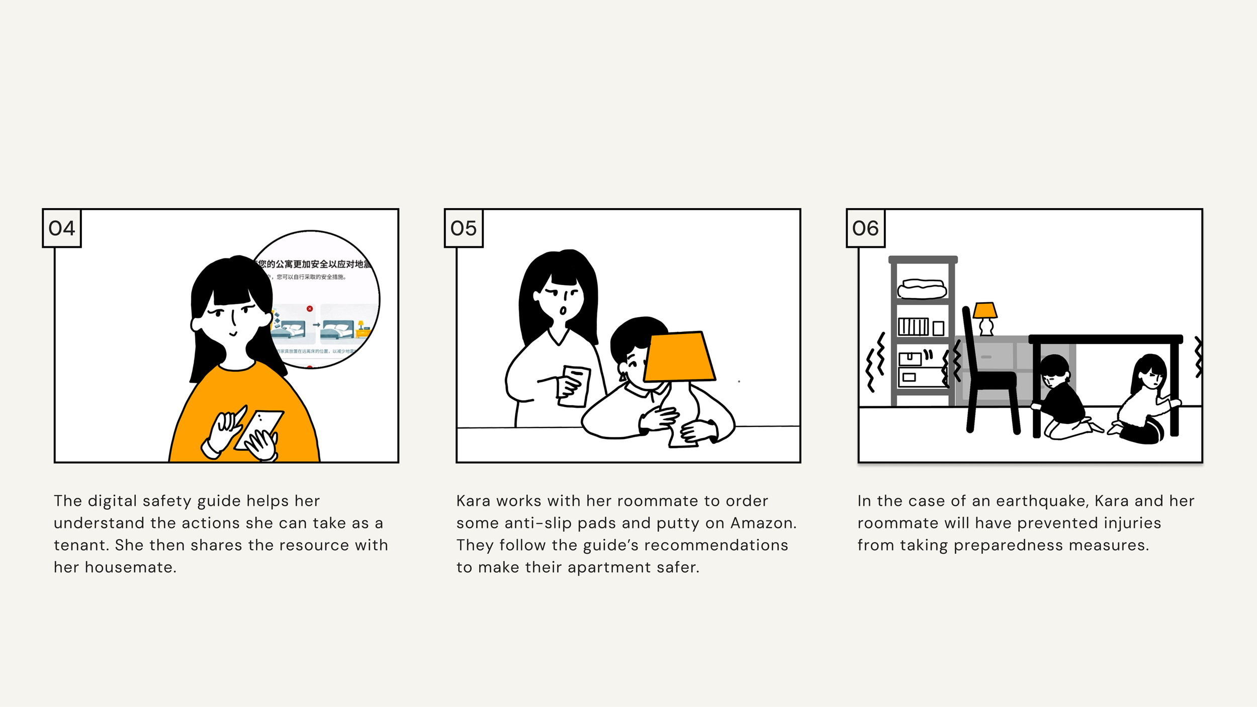
Storyboard maps the user journey.
A storyboard was created to visualize how renters encounter and interact with the system—from noticing the poster in the elevator to scanning the QR code and applying safety changes at home. It helped define key touchpoints, refine the flow, and ensure the experience felt intuitive, immediate, and grounded in real behaviour.
Designed for impact within real constraints.
The solution works by focusing on what renters can realistically control, translating research into clear, actionable steps that reduce everyday risks. By prioritizing interior hazard reduction and delivering information quickly through posters and QR codes, the system removes common barriers like time, access, and reliance on building management, making preparedness immediate and achievable.